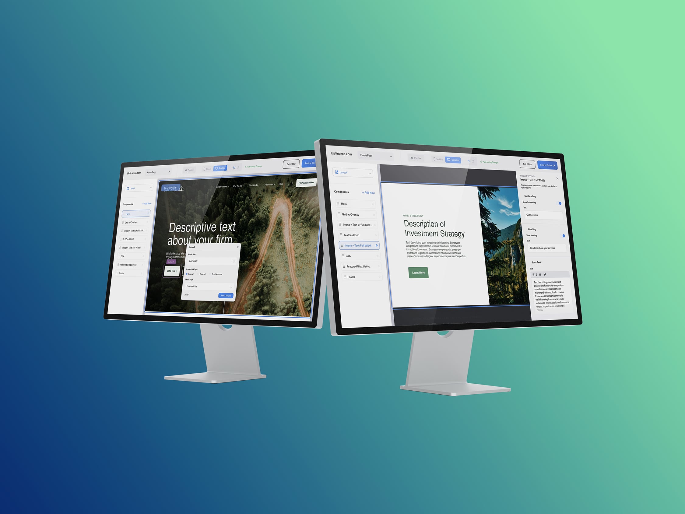
Backstitch
CMS
- Primitive
- Web-based App
Backstitch is a visual-based CMS that is used by clients that have chosen Primitive to provide them with a new website.
The Problem
Primitive’s existing custom CMS for clients was very limiting when it came to making changes and needed the client to push changes to a development site to be able to see the changes they had made. This caused any site updates to be a lengthy process with many stretches of downtime as a site deployed and caused a backlog of client requests for the engineering team if they wanted to make a change that was beyond the current CMS’ limited capabilities.
The Goal
The goal was to provide our clients with a new CMS that allowed them to make content changes to their sites using a visual editor, such as Squarespace or Wix, or a more text-based editor for users who were more comfortable editing that way. It was important to have the option for a user to use either method. The CMS needed to be quick and simple, while still providing a bevy of expected features to the client.
My Role
I reviewed the research and wireframes conducted by the UX team, suggesting alternative content and flows as needed. Once the wireframes and customer journeys were approved, I led a team of two other designers in the initial stages of color, typography, and layout explorations. After these explorations, I took over as the sole designer for the remainder of the project, producing high-fidelity designs and prototypes. After the prototypes were complete, I conducted user testing to pinpoint any pain points that were discovered by users and to confirm design decisions that had been made. Iterations were done as needed, and then I worked closely with the engineering team to ensure a successful handoff and that all aspects of the design were accurately represented in the developed product.
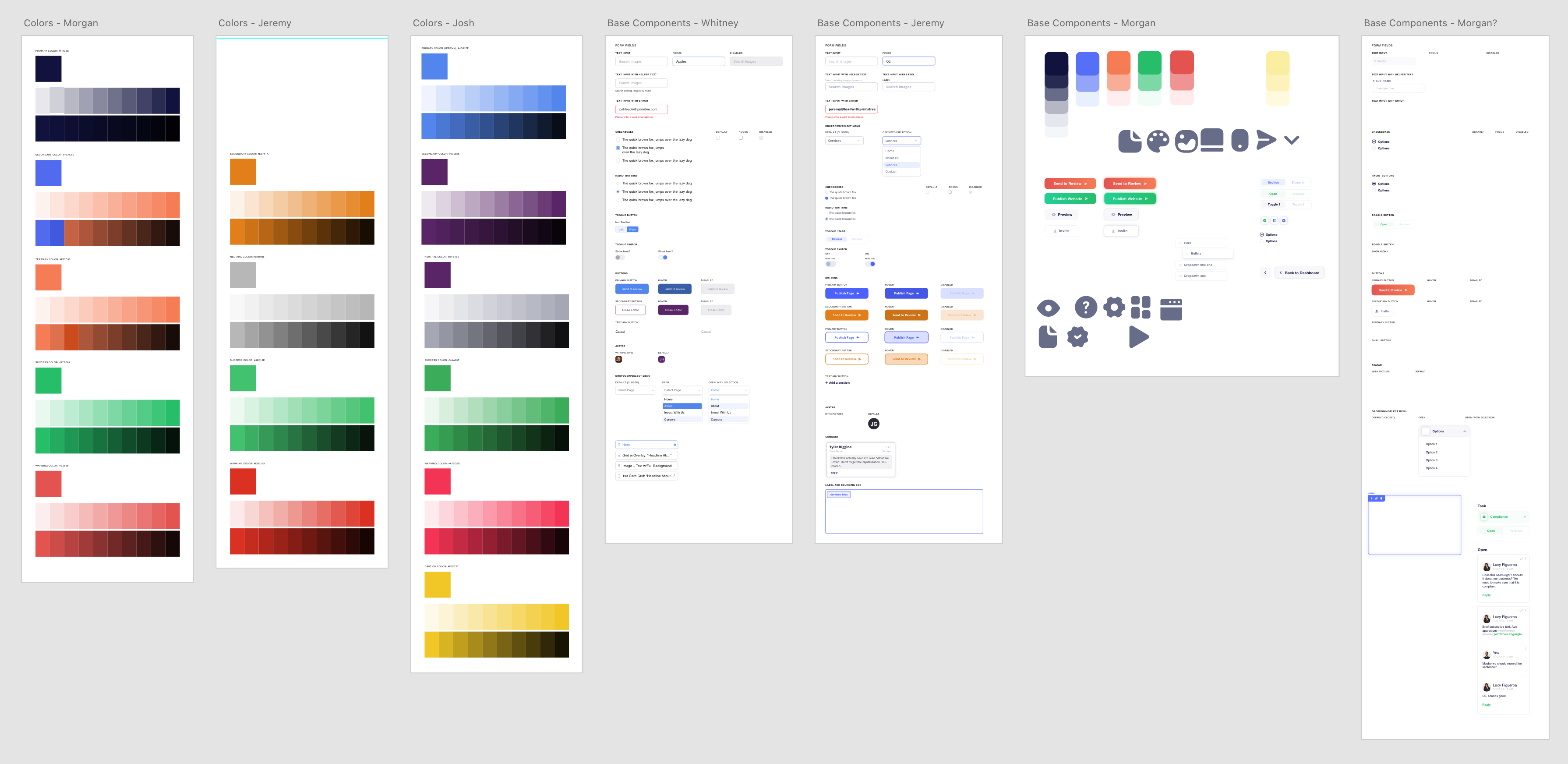
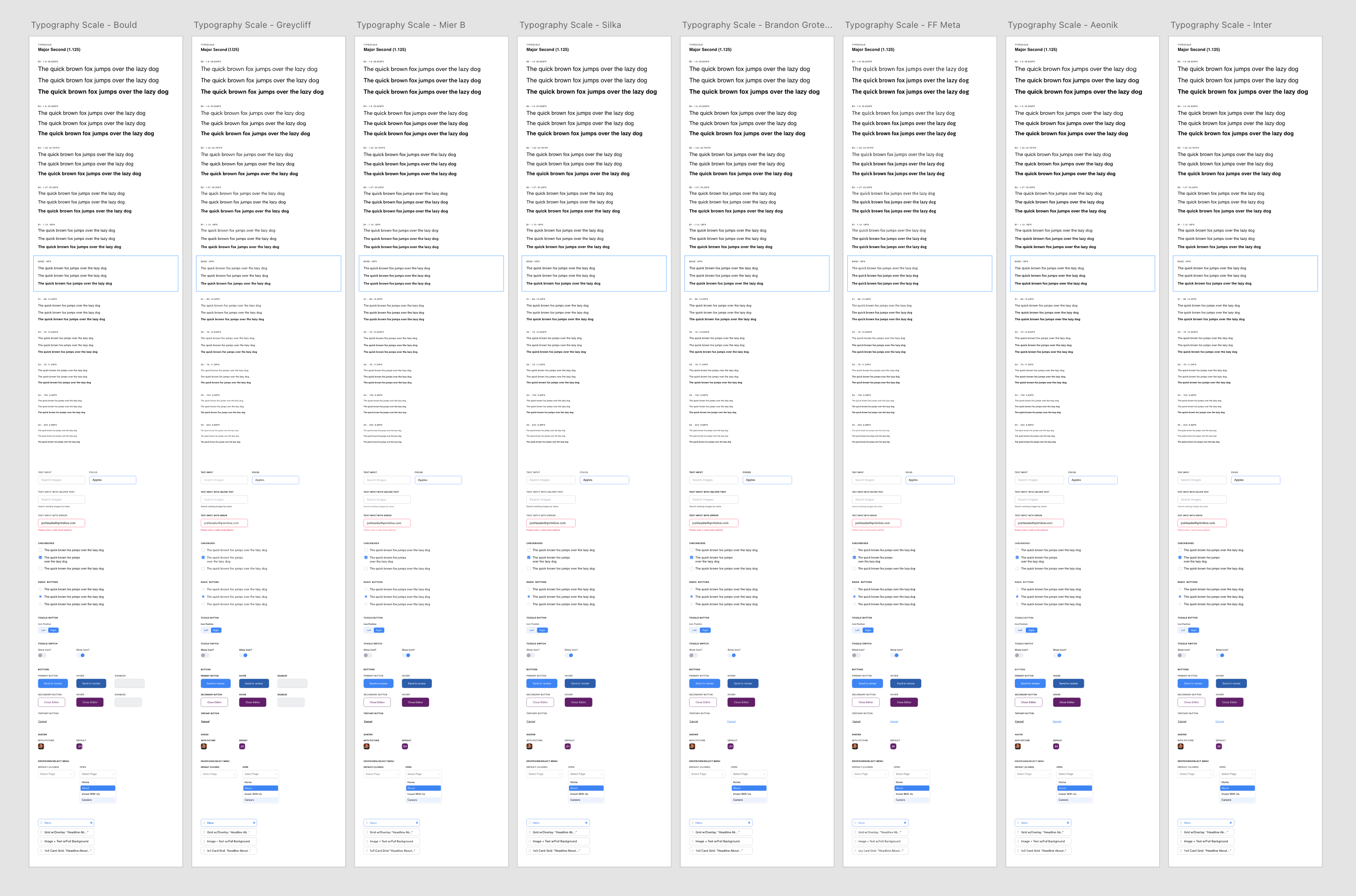
Initial Design Explorations
Color, typography, and component explorations were done by myself and two other designers whom I was overseeing.
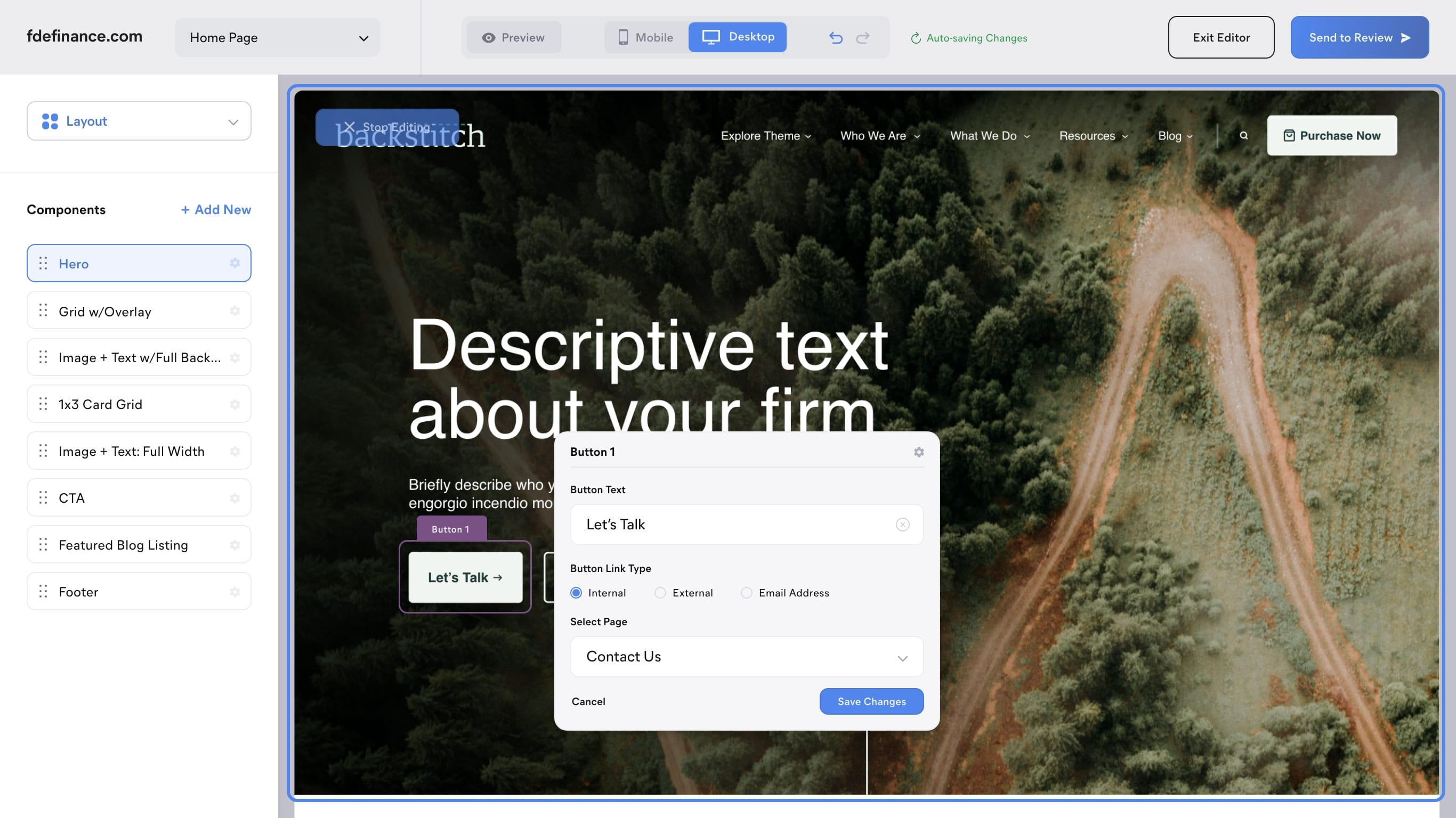
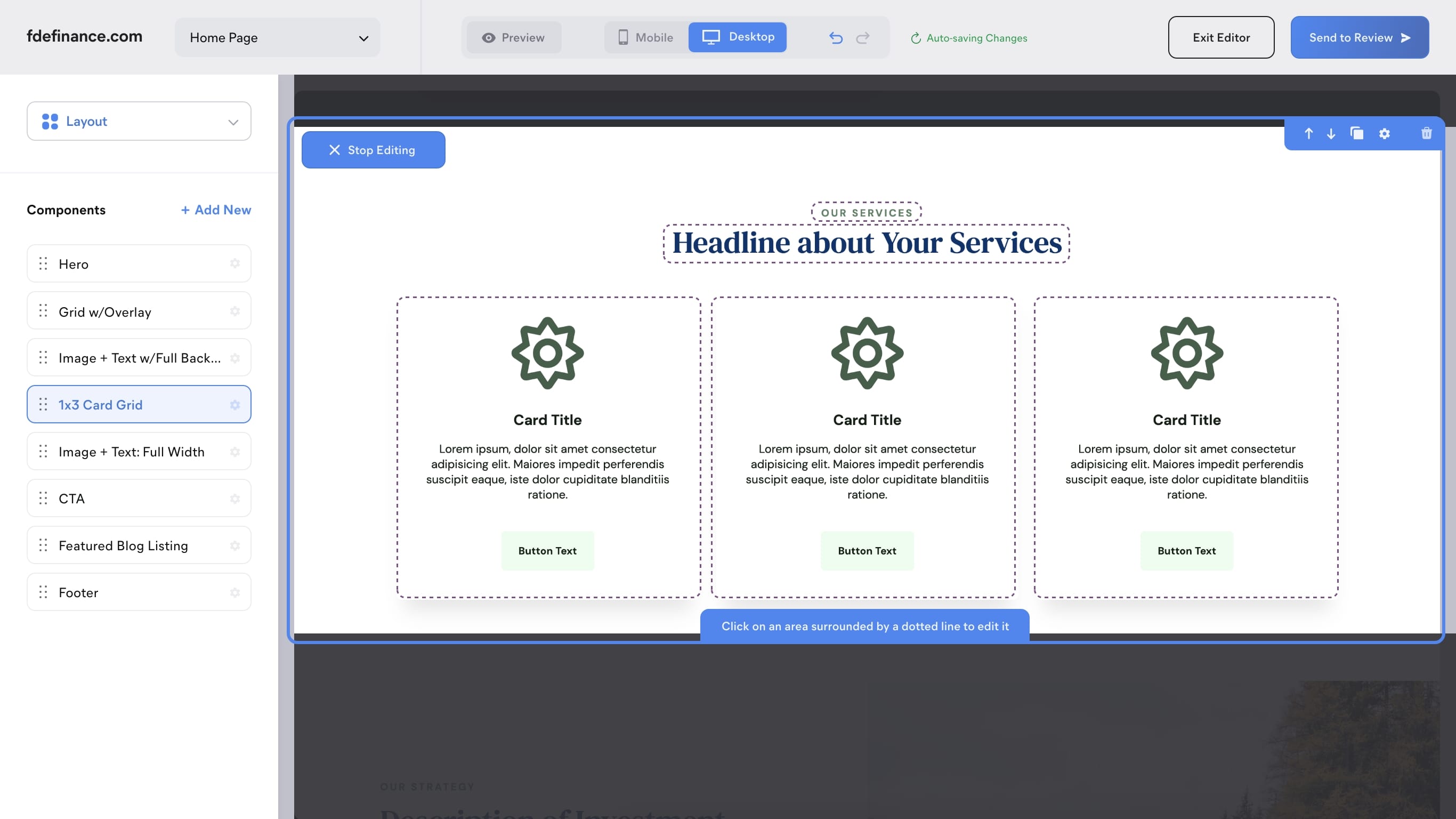
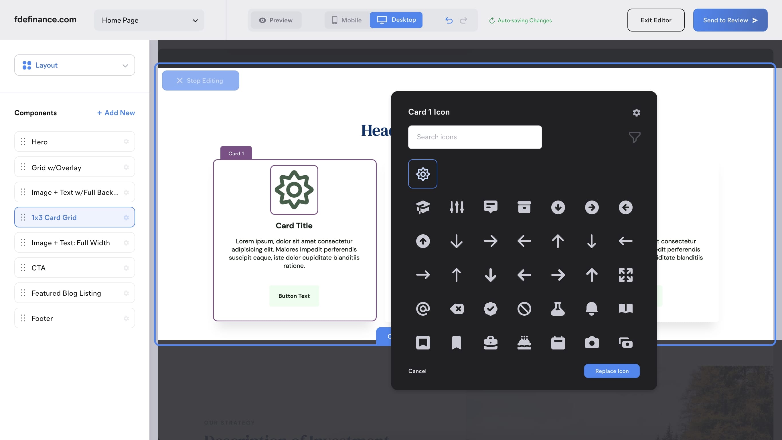
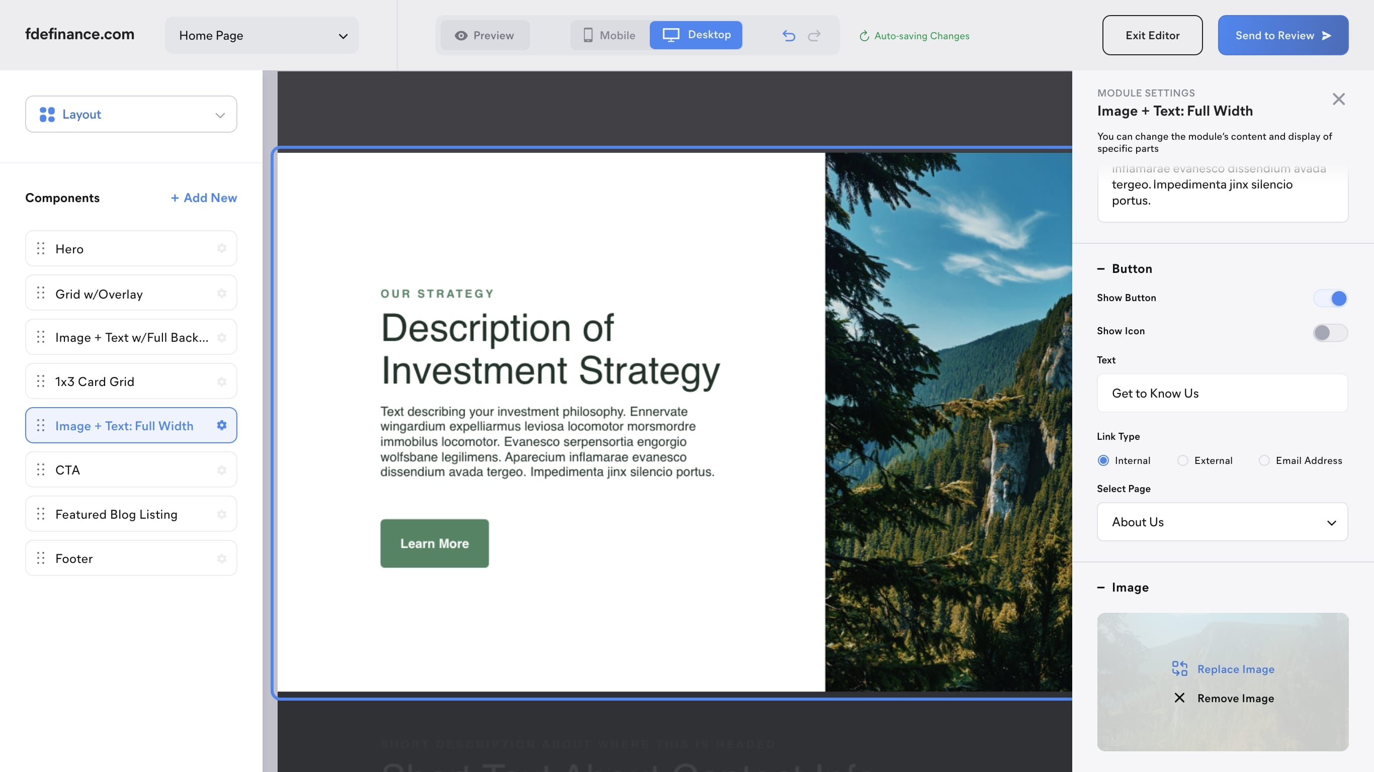
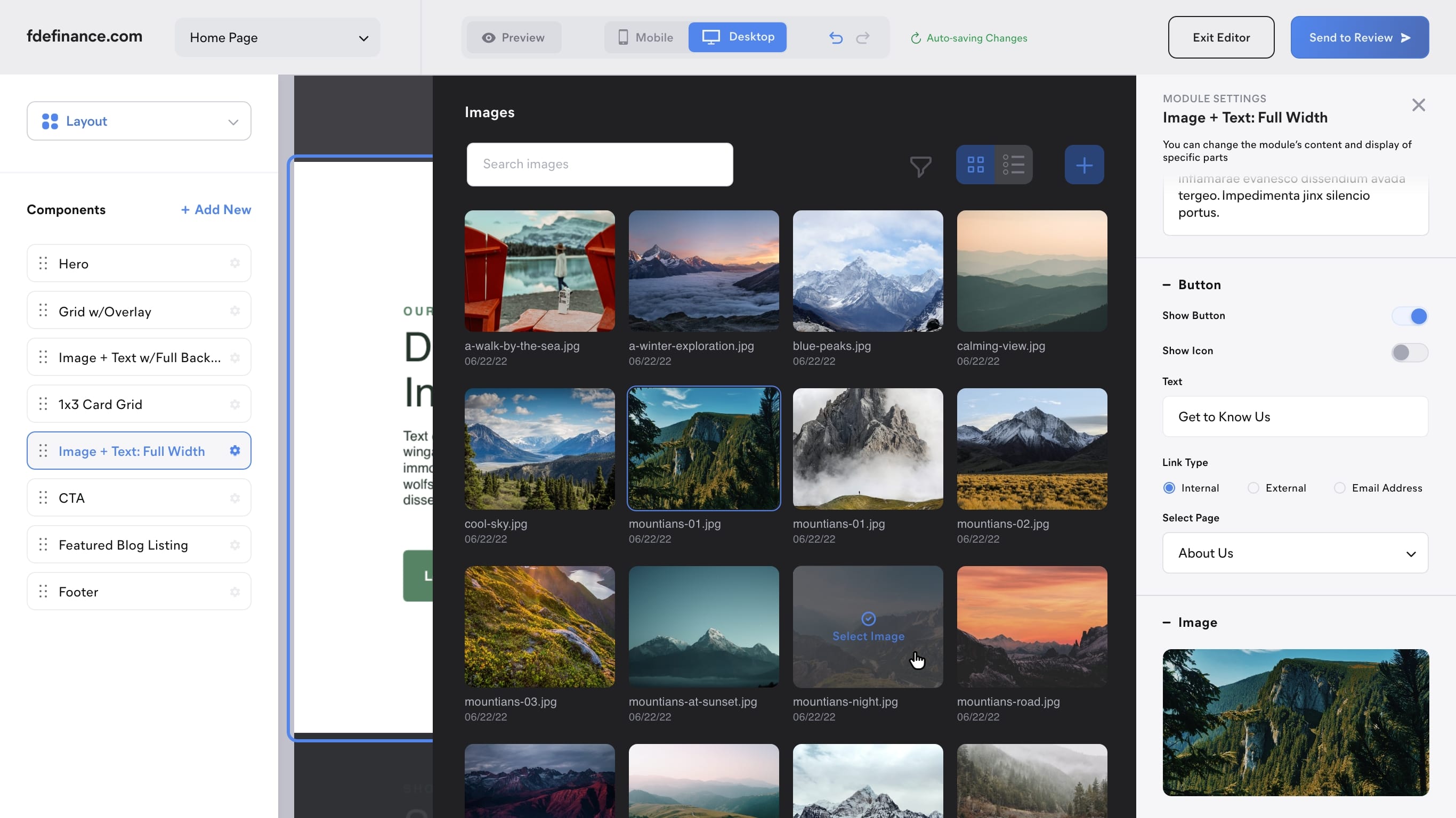
Visual Editor
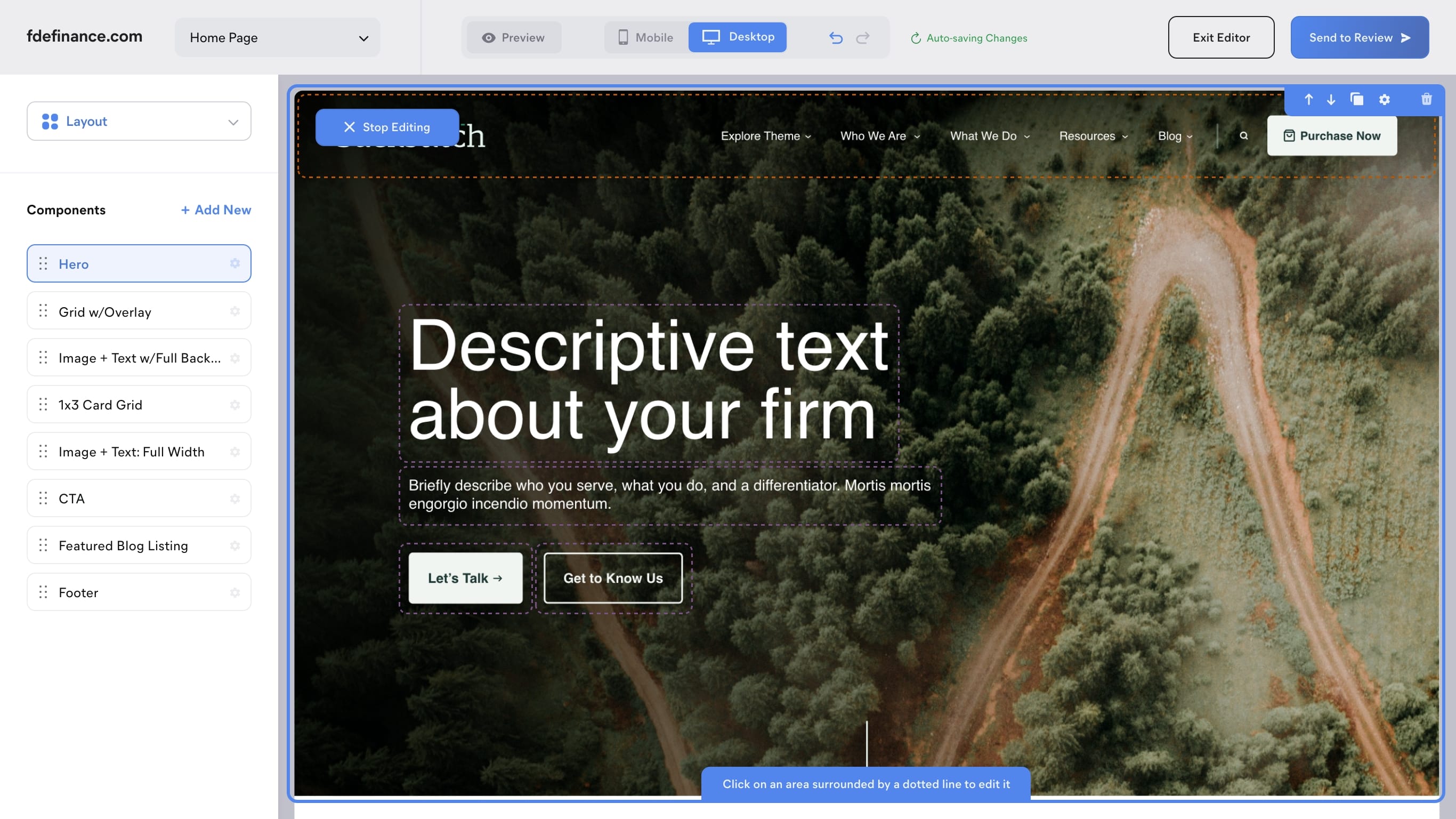
We knew that a visual editor was going to be a key feature of the software from the very beginning, so it was important to spend time getting it right. It needed to be intuitive and easy to use, and at the same time not overwhelm the user with too many options.
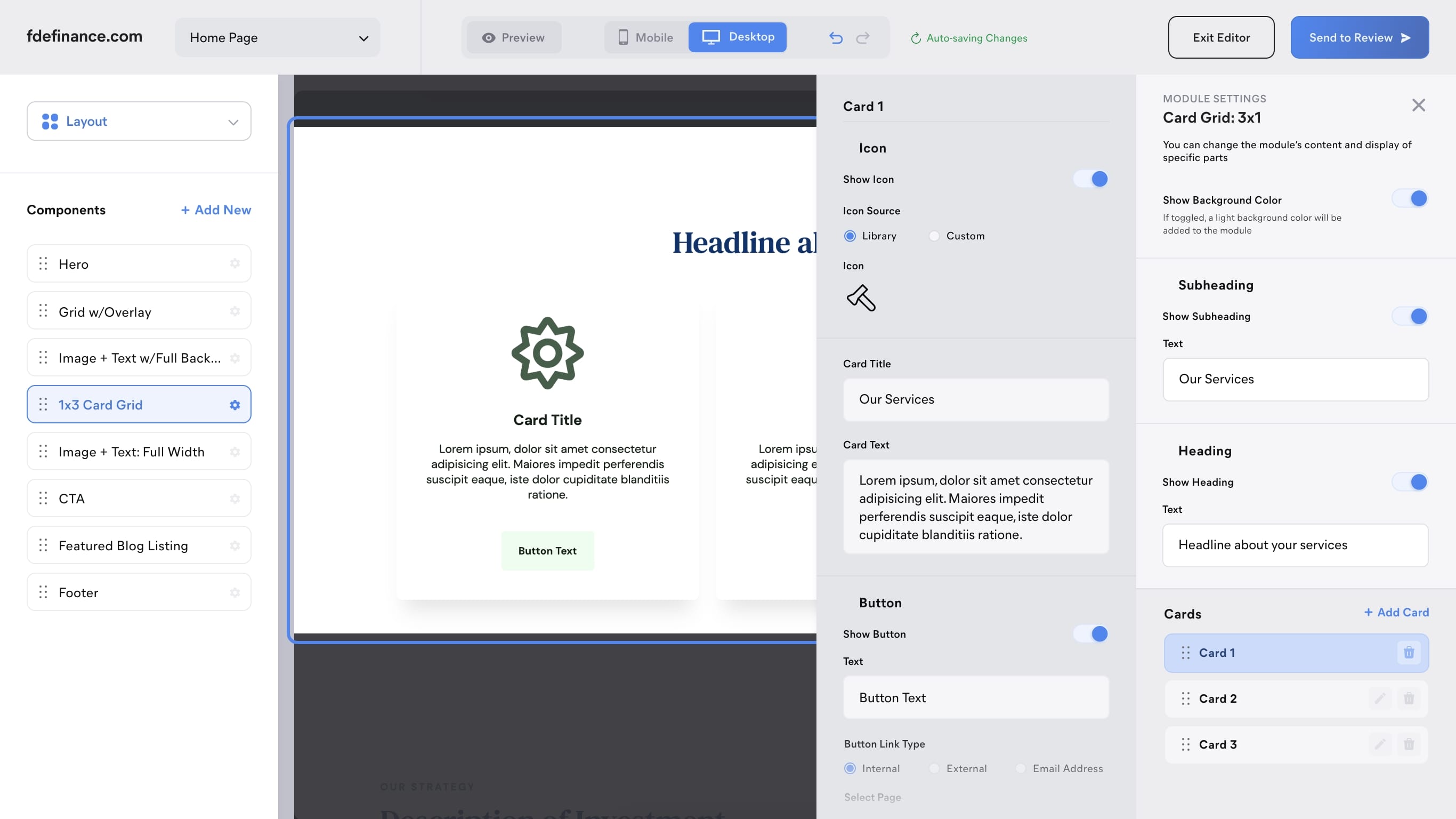
Module Settings
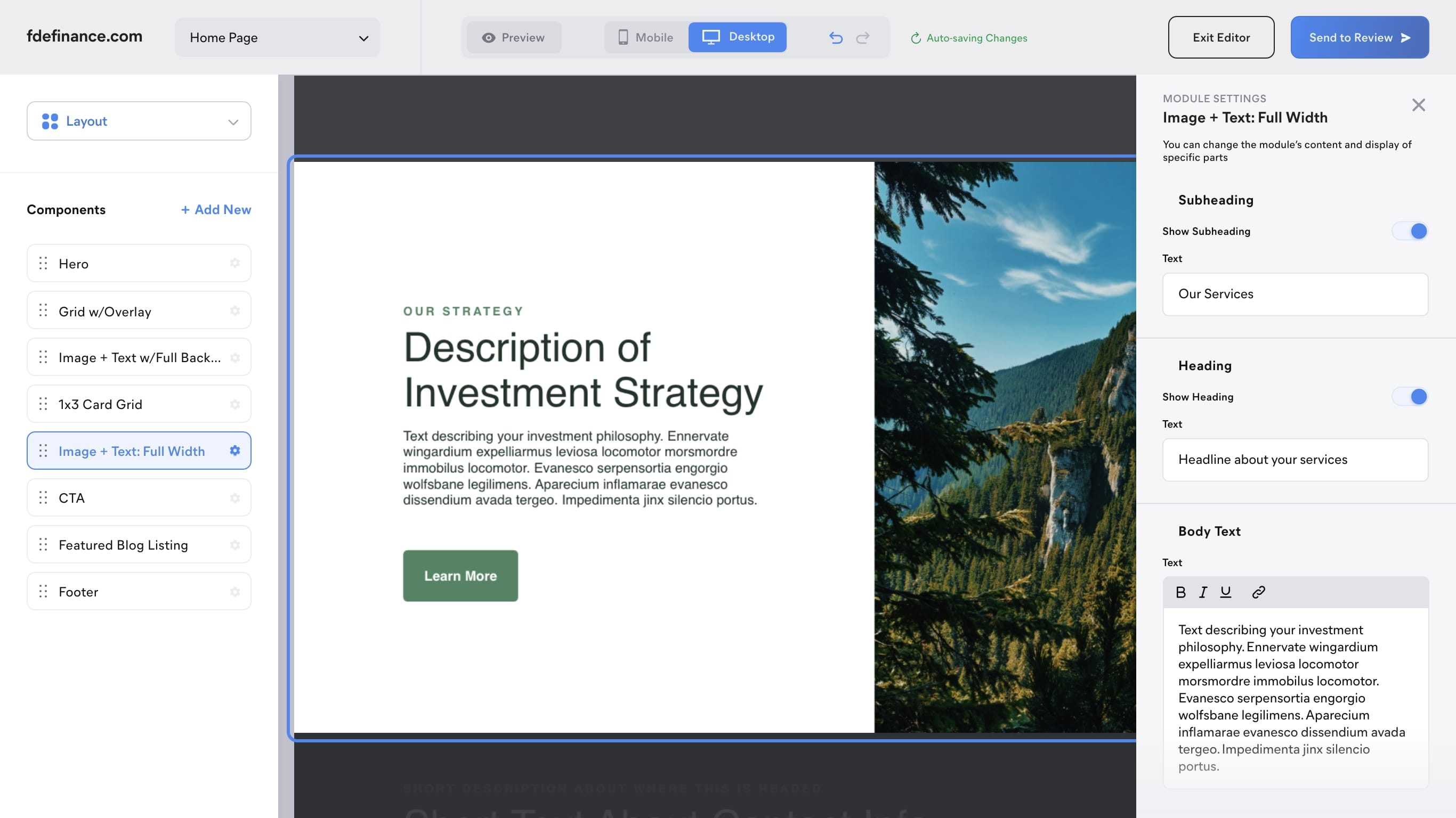
As important as the visual editor was to the product, I discovered that there were going to be some parts of a module that would get too complicated if I tried to fit them all into a modal window. To solve this, I added a sidebar containing a module's complete set of options. Based on feedback from A/B testing, I added all the editable fields to the sidebar to give the user more than one way to edit content.
Blogs
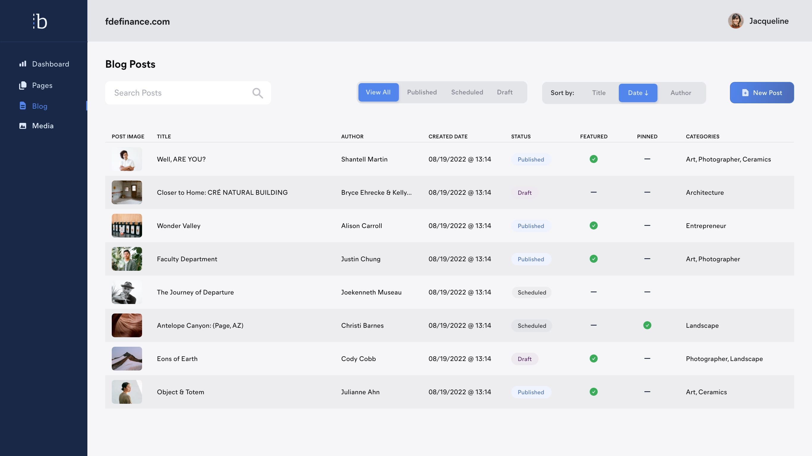
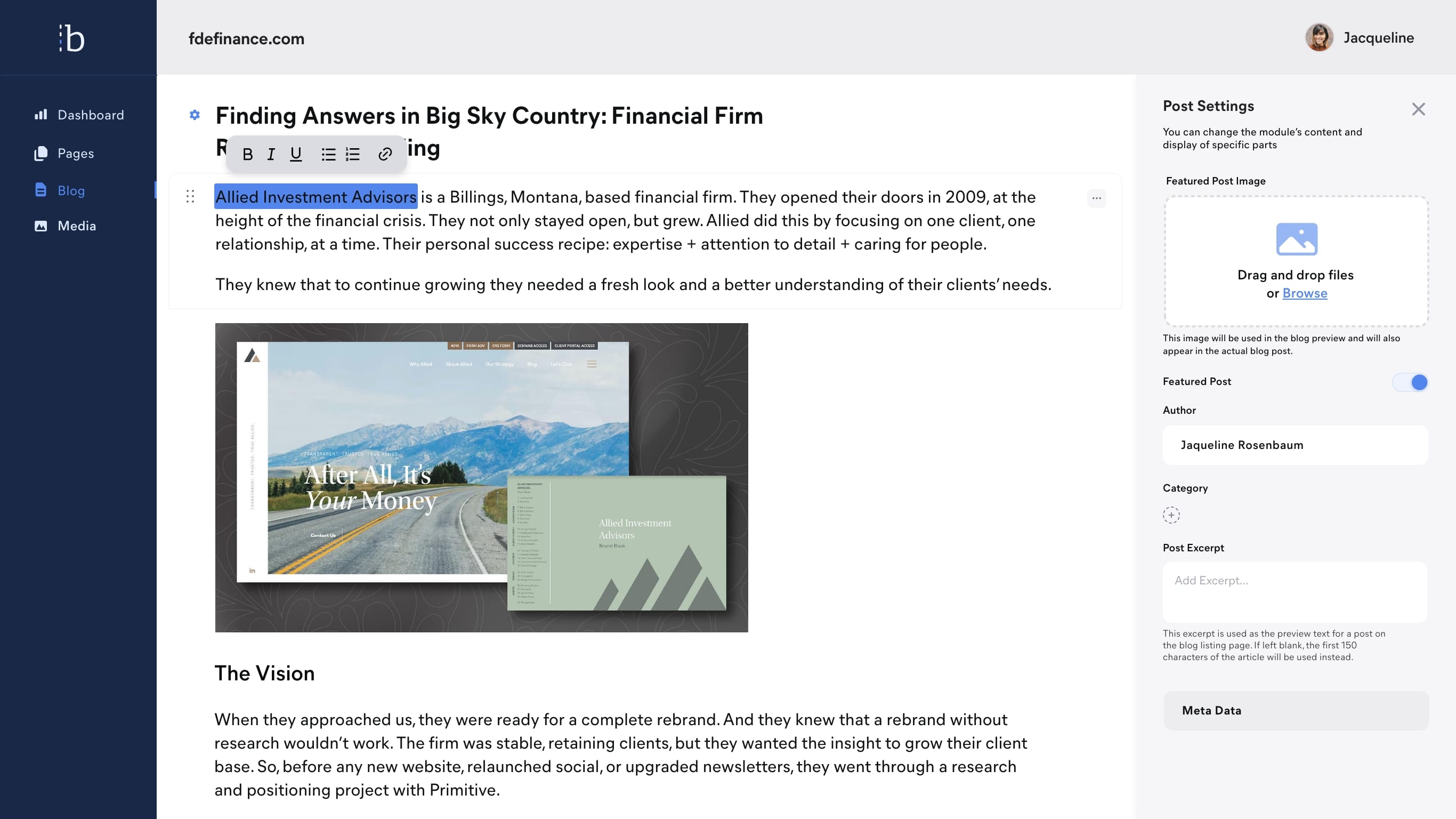
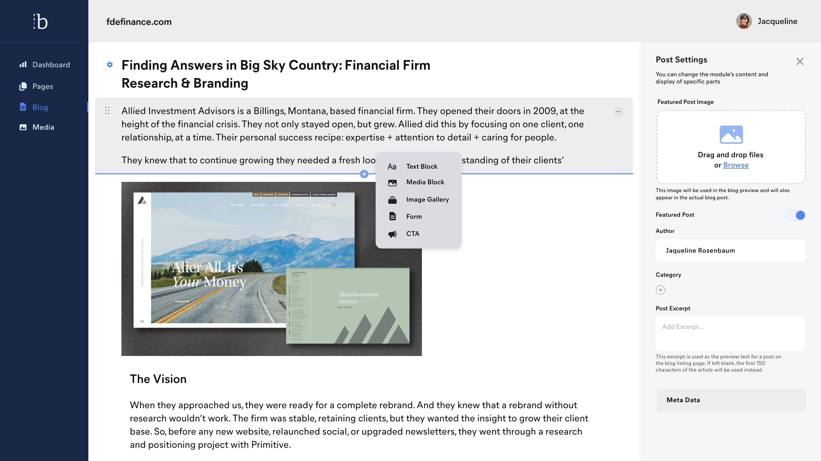
Another main feature of the app is the ability to publish blog posts. We wanted this to be a simple experience, with a very clean UI that would not interfere once content was added.
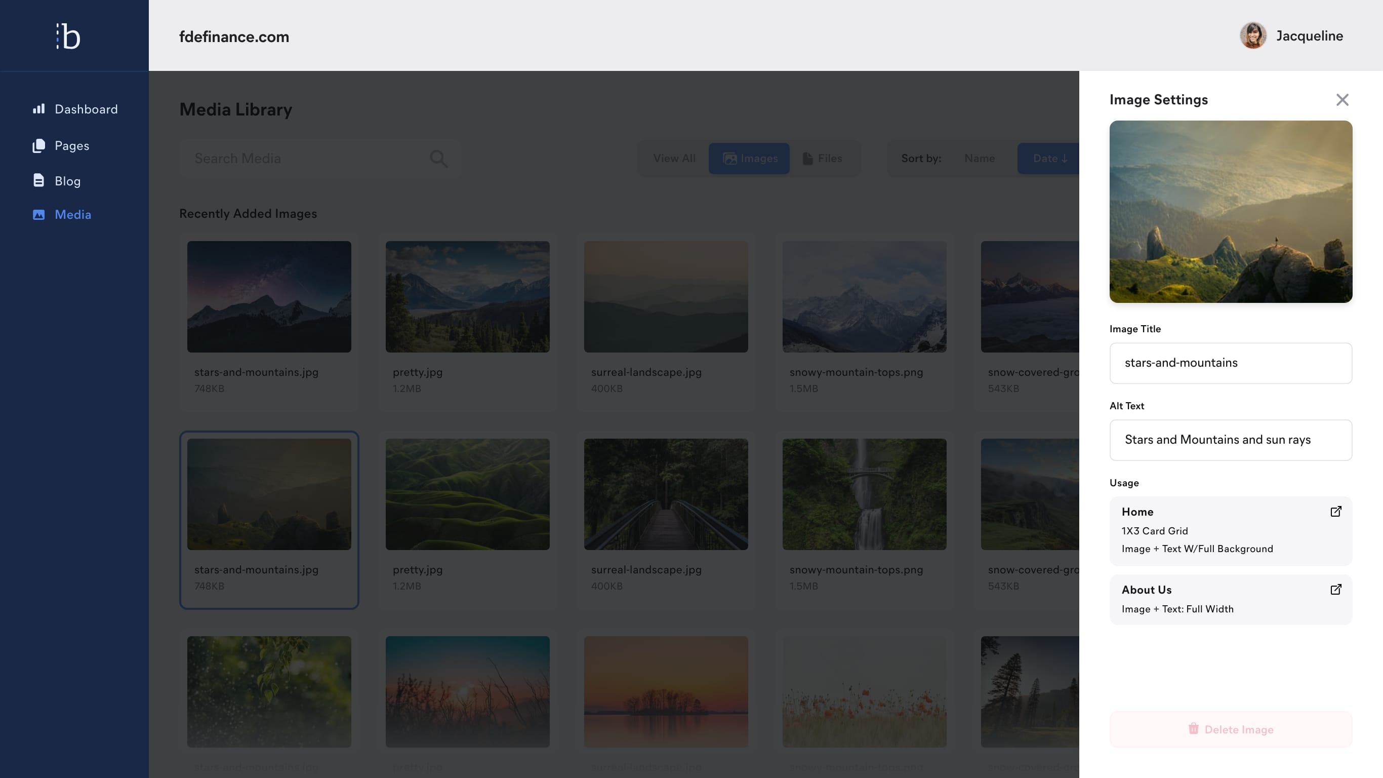
Media Library
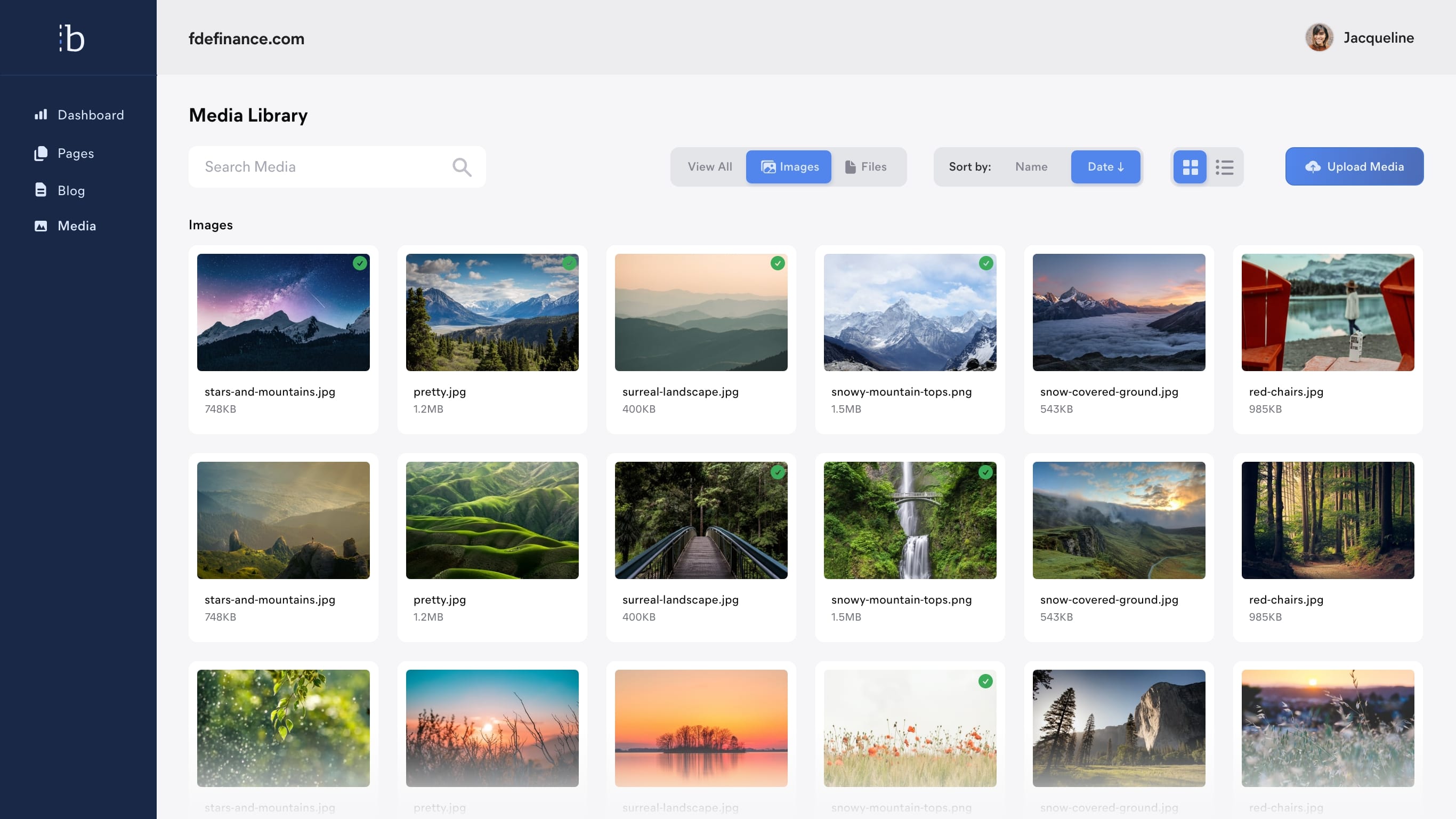
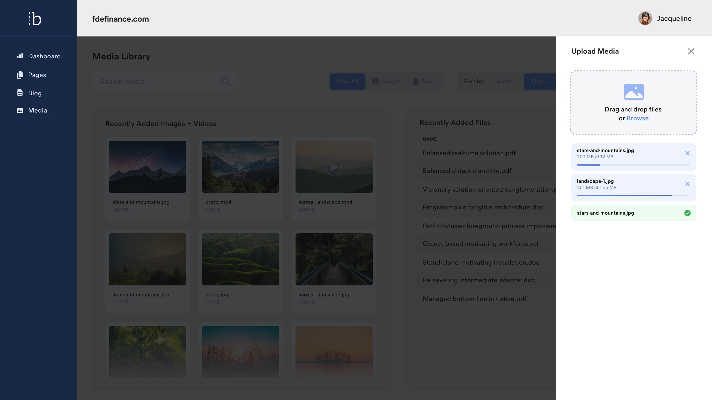
The ability to easily add and manage media is a key part of any content management. In our research, we learned that document management was an important aspect for financial firms because they would often upload numerous PDFs of rules and regulations.
Results
This project reached about 80% completion when Primitive needed to table it until a later time due to market conditions. I believe the design and user experience will be successfull for clients, allowing them edit their sites in a way in which they are most comfortable.