Quext
- Madera Residential
- Web-based App
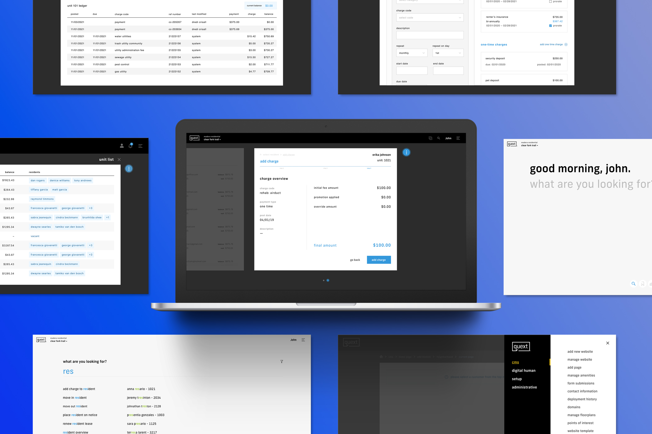
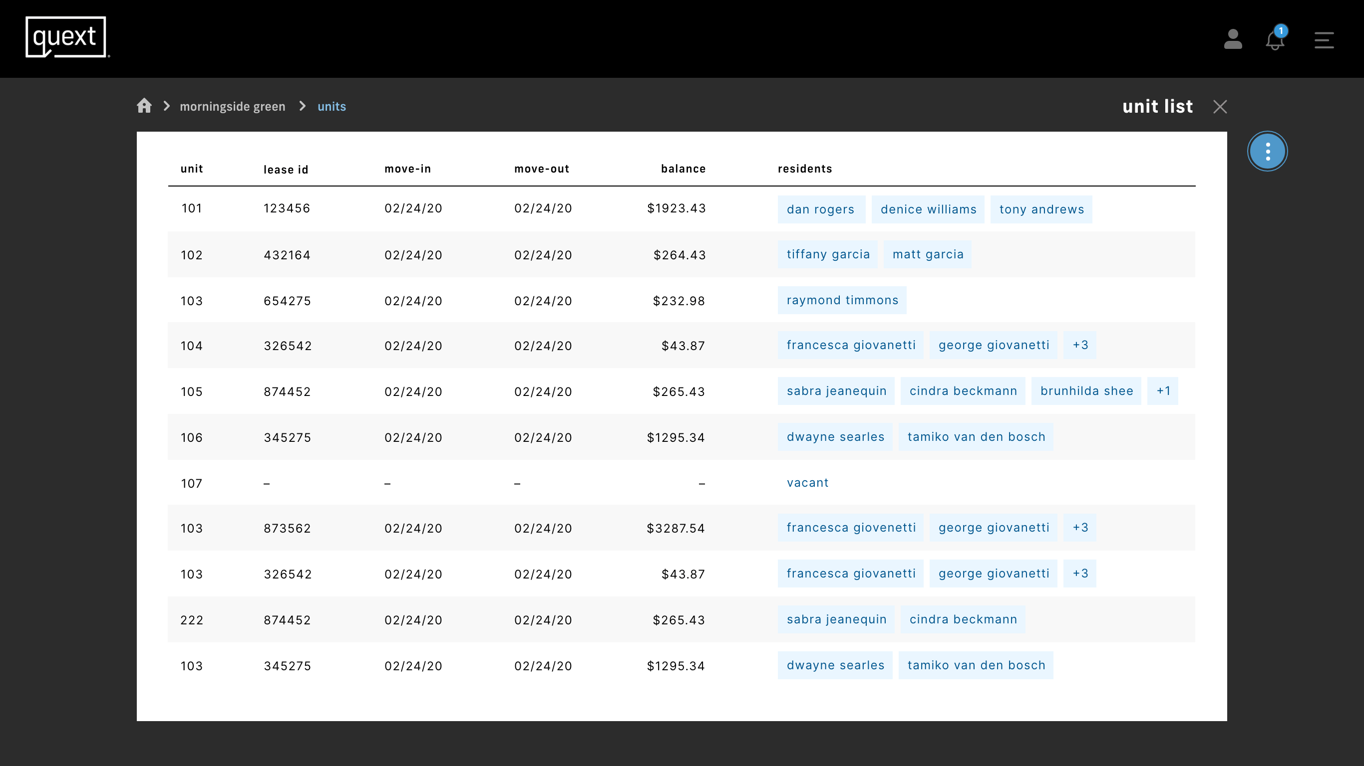
Quext is an apartment management software that handles all aspects of running an apartment complex, including accounting, maintenance, resident and lease management, a custom CMS for website creation and reporting, and a virtual assistant.
The Problem
The client came to us to create a product that would be able to be used in their apartment complexes, as well as for them to be able to white label it and license it to other companies. Their tagline for Quext was "brilliantly simple," which needed to be the guiding principle as I was working on a design. They challenged us to do something different that wasn't being done in the space currently and to make it work in a way that could scale to lots of use cases.
The Goal
The goal was to provide our clients with an all-encompassing piece of software that would allow them to manage and run their different apartment complexes. They had been using several different applications that all had a unique function, such as accounting or resident management. The problem with this was that none of the applications were built for the way they did business. There was some customizability, but they were fighting the software to get it to work the way they needed. The other main issue they had come across was that it was very difficult to share the data between the different applications because each one was created by a different company. This required them to enter a lot of their data in multiple places, opening up room for human error with each piece of data.
My Role
I was the primary UI Designer, led Art Direction, and assisted with the UX Design, including strategy, wire-framing, and user journeys. I also assisted with the front-end development of the app.
Initial Design Explorations
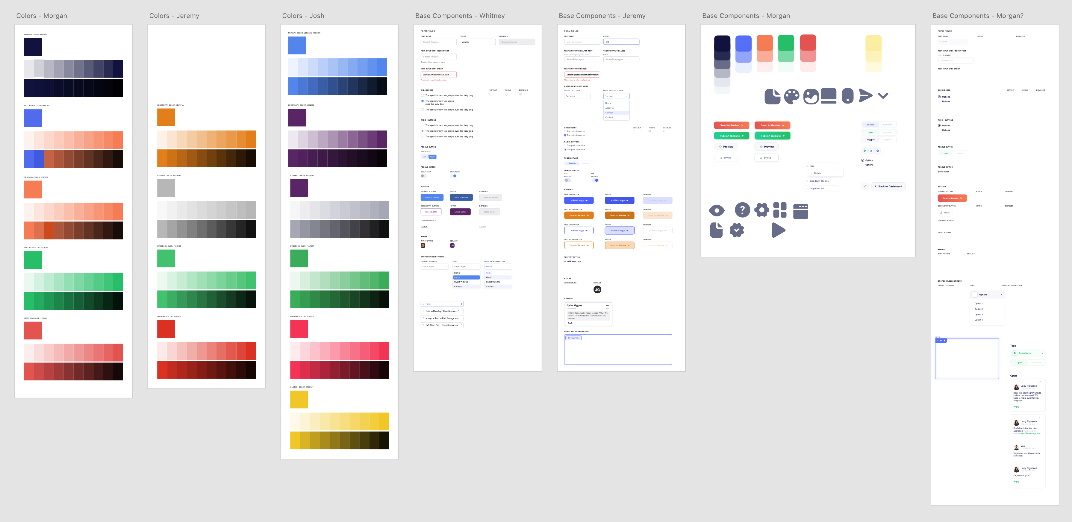
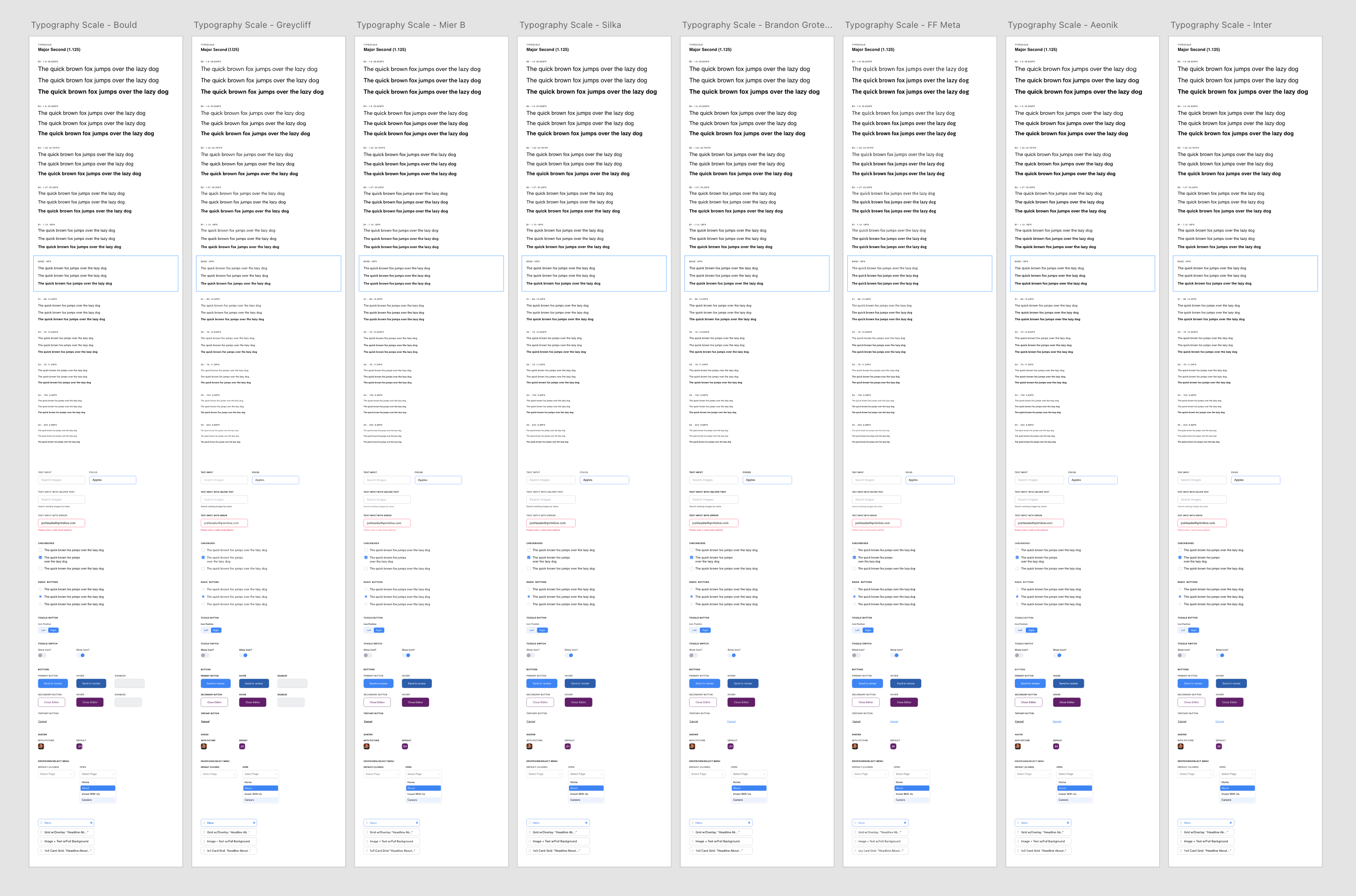
Color, typography and component explorations were done separately by myself and my team of designers.
Navigation
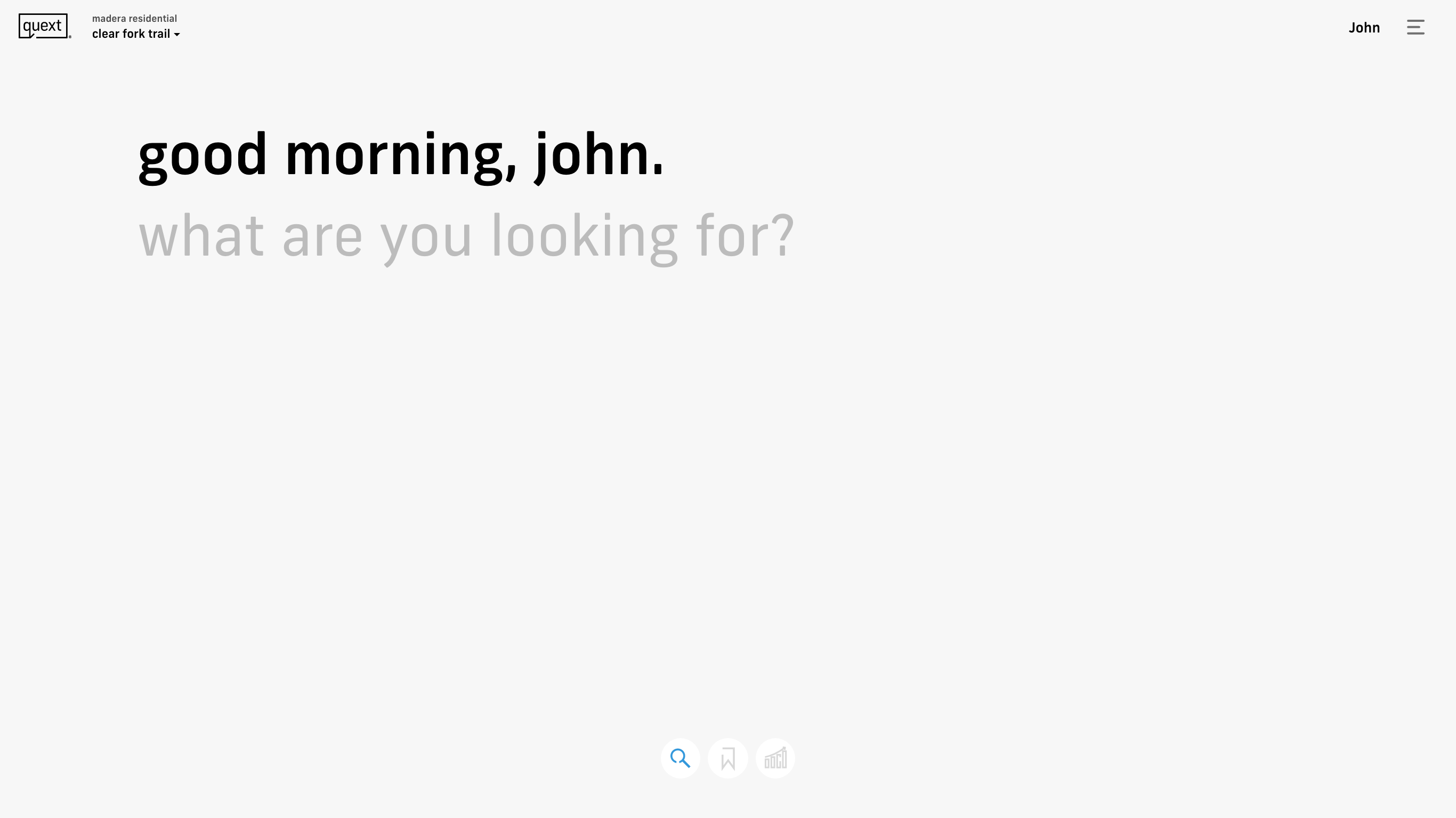
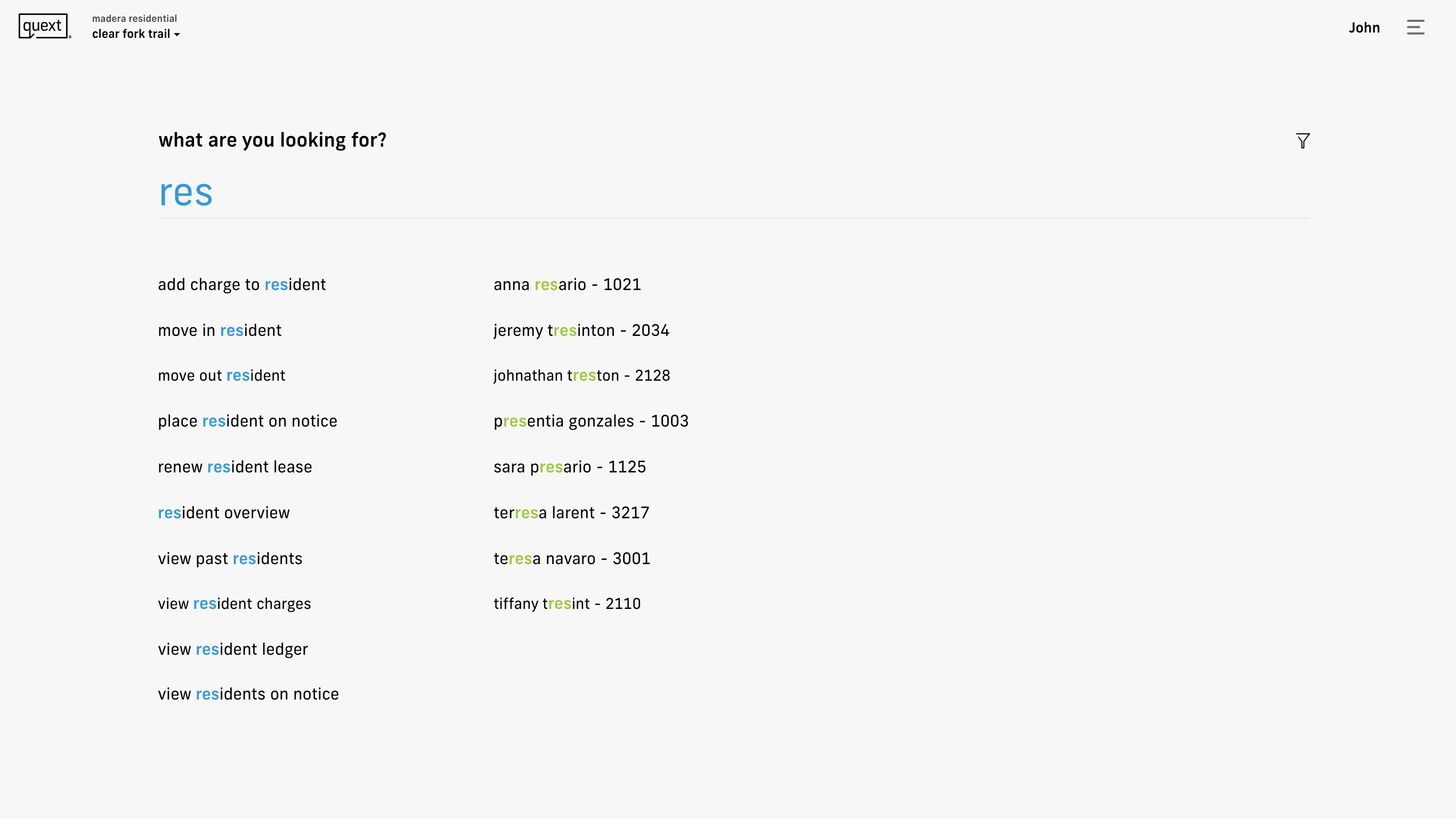
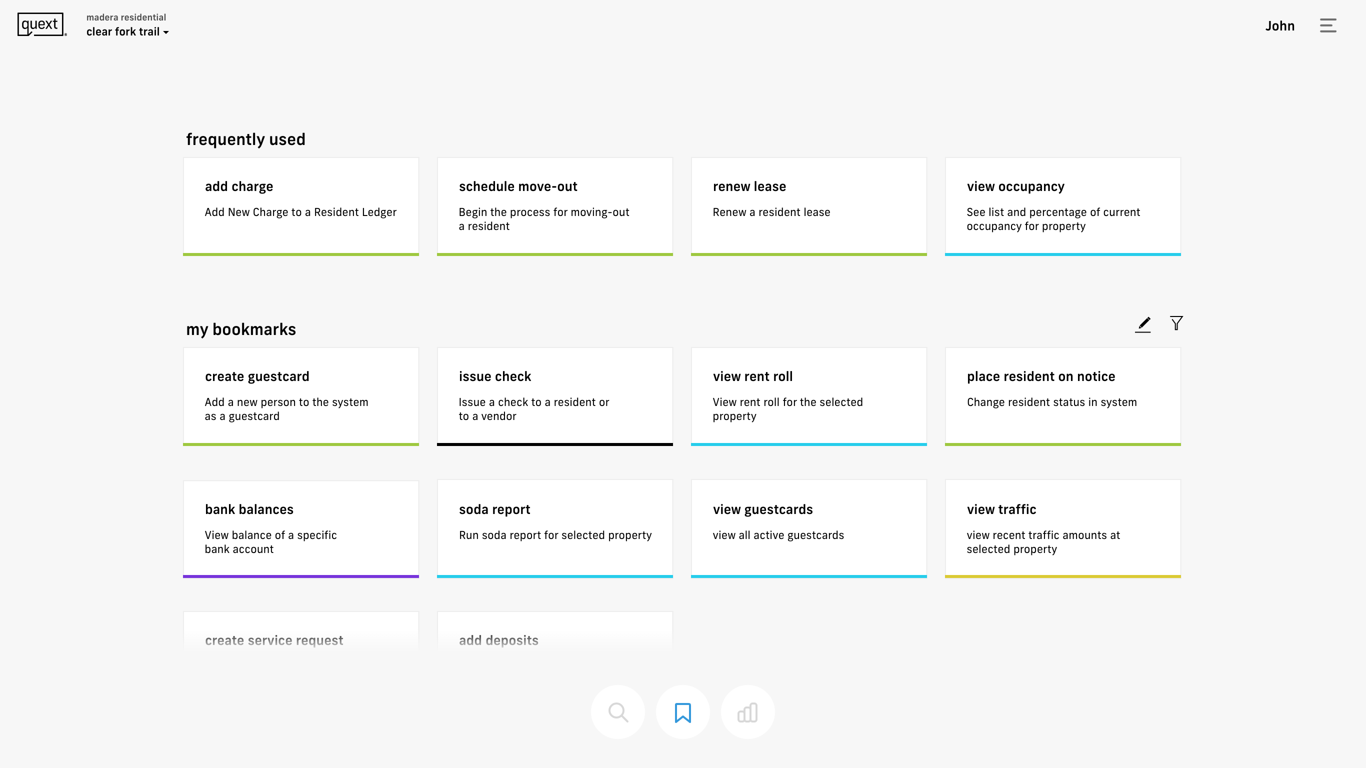
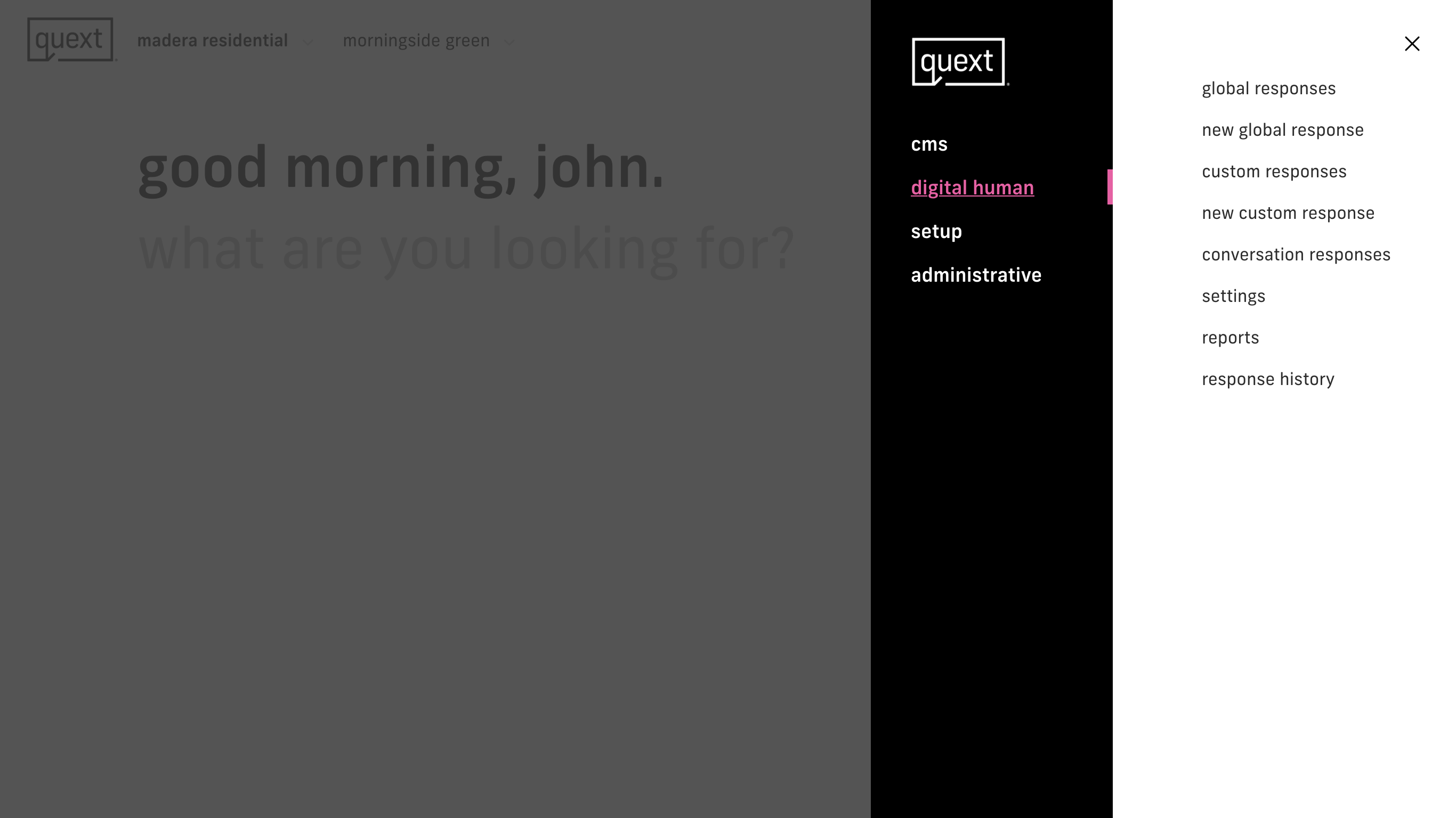
From our research, I learned that many times a user would use the software with the intent of completing a single task, meaning they would open the application with the need to look up a resident, or enter a new line item for accounting, etc.
Flows
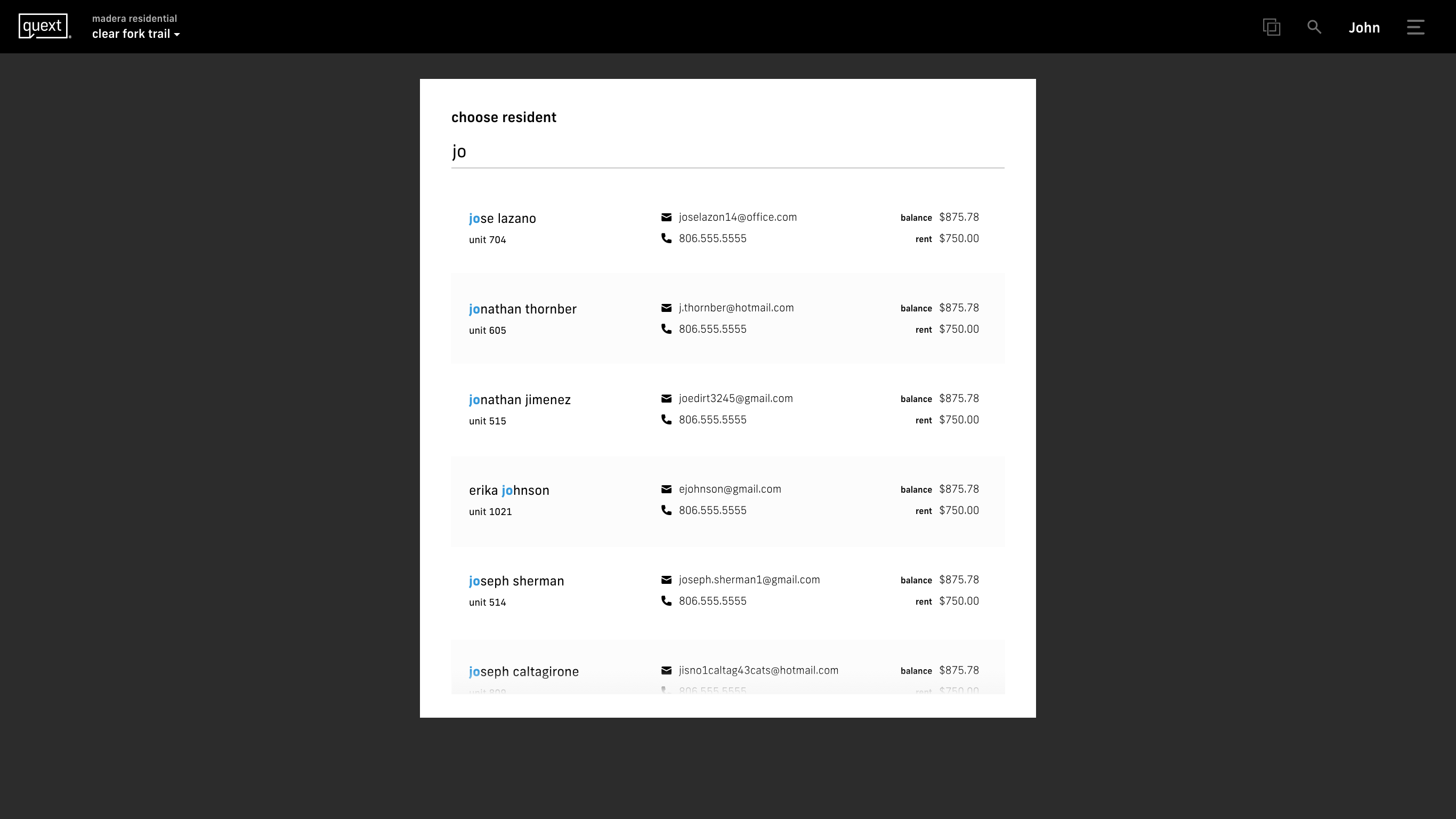
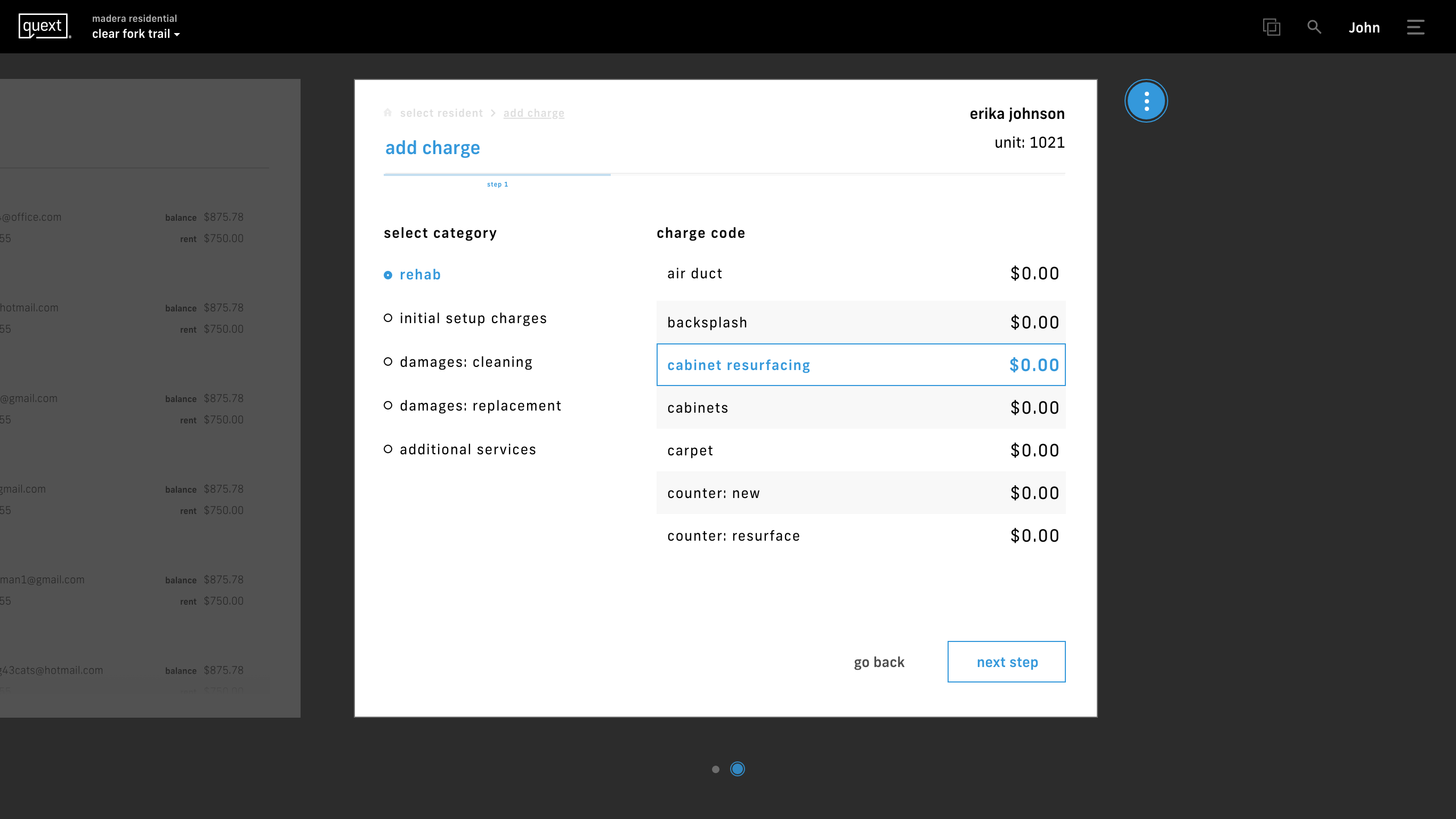
Often, software is guilty of the “show everything the user might want to see on one screen” approach. This overabundance of information and choices can quickly lead to cognitive overload and decision fatigue for the user. To help combat this, Quext approaches tasks by way of flows. A flow breaks down a task, or set of tasks, into separate cards, presenting the user with only the information that is needed to move forward in the flow. This allows the user to easily see a task from start to finish, eliminating any distractions or confusion.

Additional Screens

Results
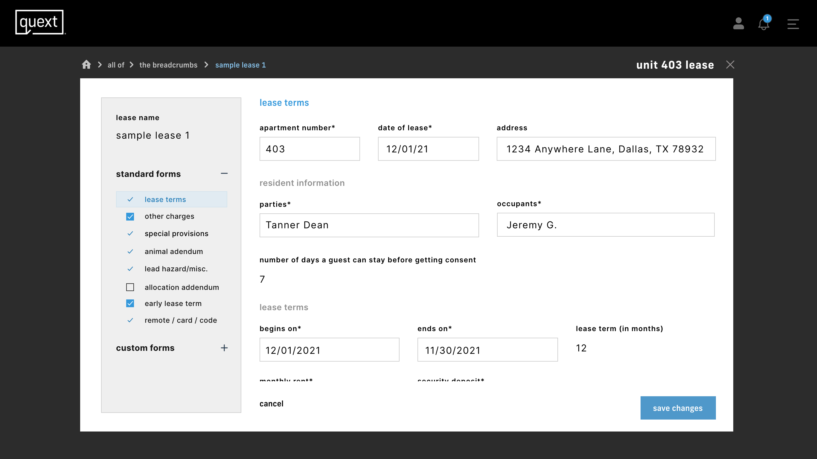
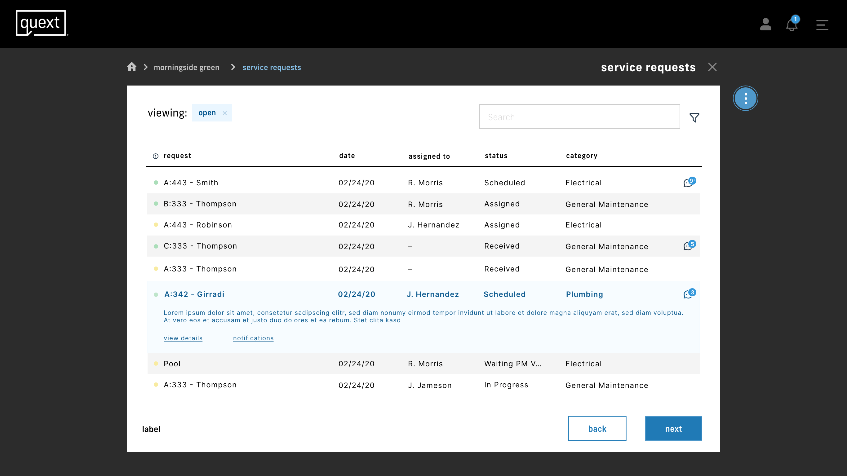
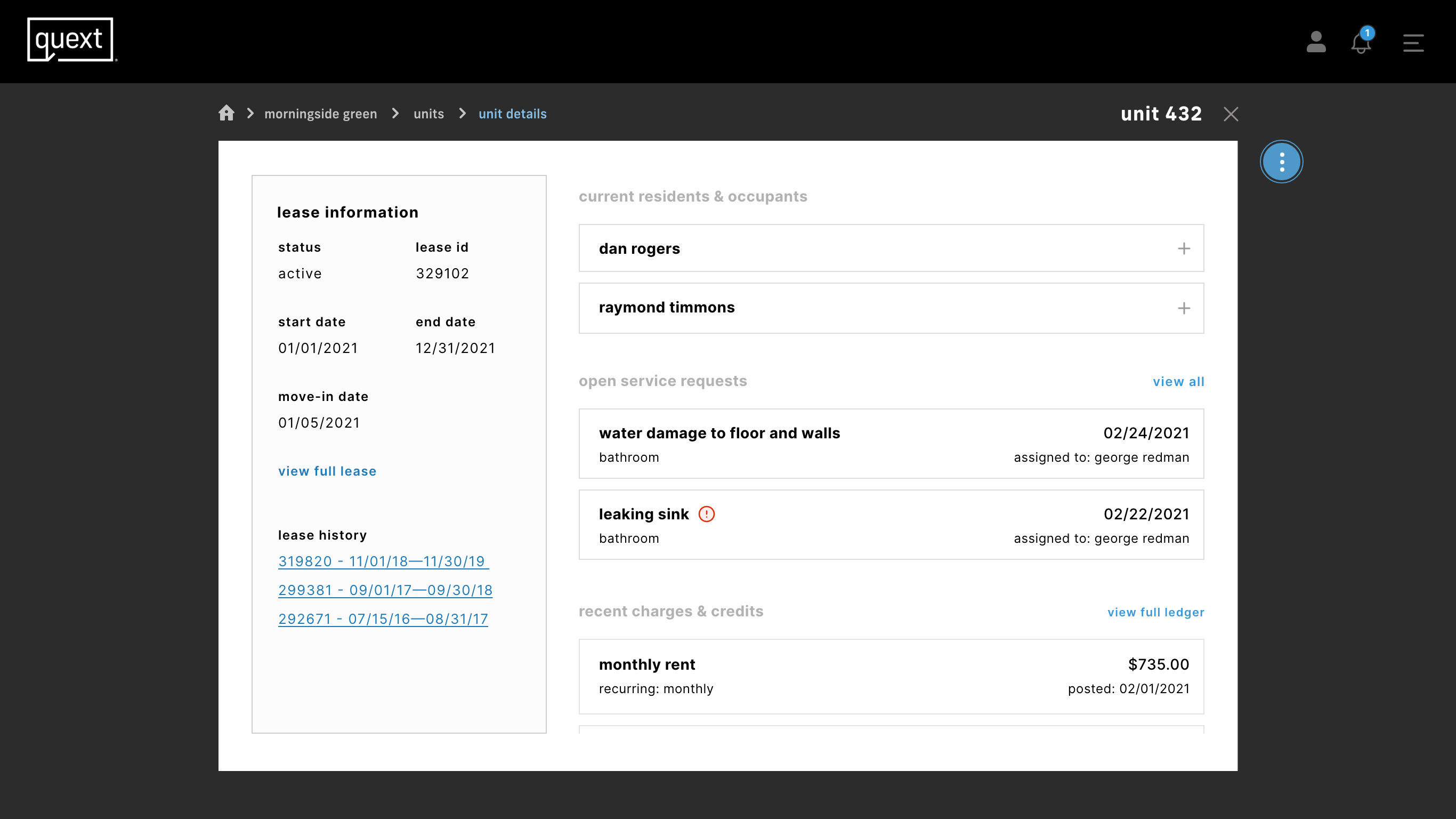
This product was handed off to the client's internal team when it was close to ready for launch. The different sections I ended up designing included accounting, user management, lease management, service requests, a custom CMS for their property websites, and a hub for their AI chatbot. Each of these sections was previously separate pieces of software from various vendors that the client subscribed to. Their goal was to have the software fully implemented in their more than 30 properties within 6 months. Having a fully integrated and connected system allows the client and their staff full access to all areas of a property's management, allowing them to more quickly complete daily tasks.