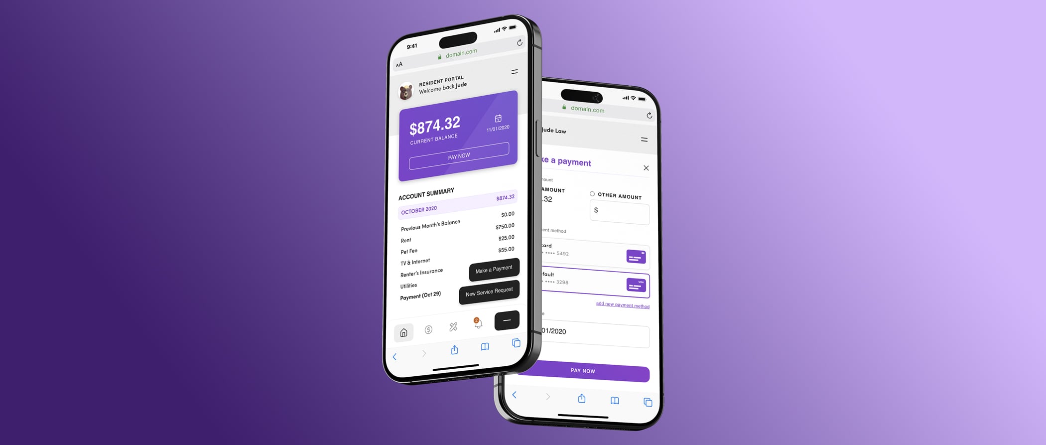
Resident Portal
- Madera Residential
- Web-based App
The Quext Resident Portal is an app used by residents of apartment complexes to pay their rent and fees, submit service requests and update their lease information.
The Problem
The client used a 3rd party service to manage their residents' payments, and between a lack of features, poor user experience, and fees for the service, they wanted a custom-built service that was tailored for them. They challenged us to come up with a solution to improve the overall user experience, with hopes of leading to more app-based payments to cut back on the amount of manual processing they were currently experiencing.
The Goal
The goal was to provide our clients with a new CMS that allowed them to make content changes to their sites using a visual editor, such as Squarespace or Wix, or a more text-based editor for users who were more comfortable editing that way. It was important to have the option for a user to use either method. The CMS needed to be quick and simple, while still providing a bevy of expected features to the client.
My Role
I helped lead user interviews and perform competitive analysis of similar existing products. I was responsible for taking the data that was gathered and using it to build out user journeys and wireframes. I also was also solely in charge of creating a visual style for the application that was different but still complimented the client's existing branding, and then build-out high-fidelity designs of the different views. Finally, I took the visual designs and developed the front-end portion of the application, creating a usable browser-based prototype.
Dashboard
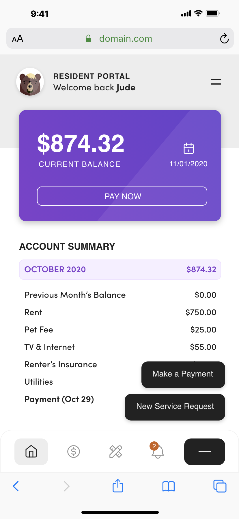
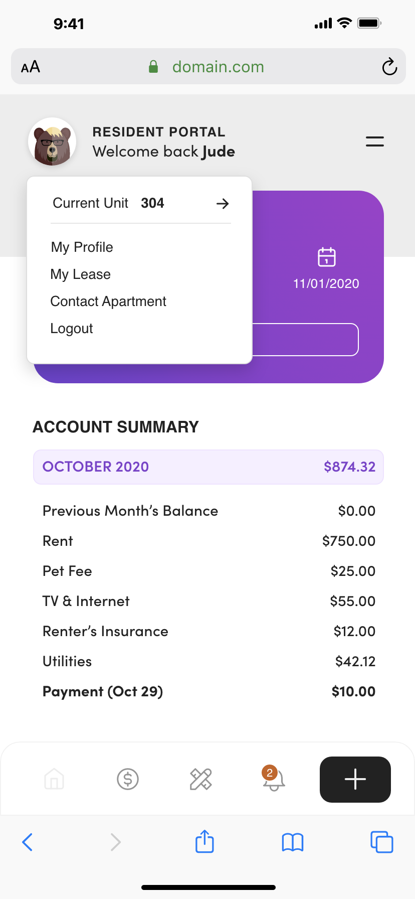
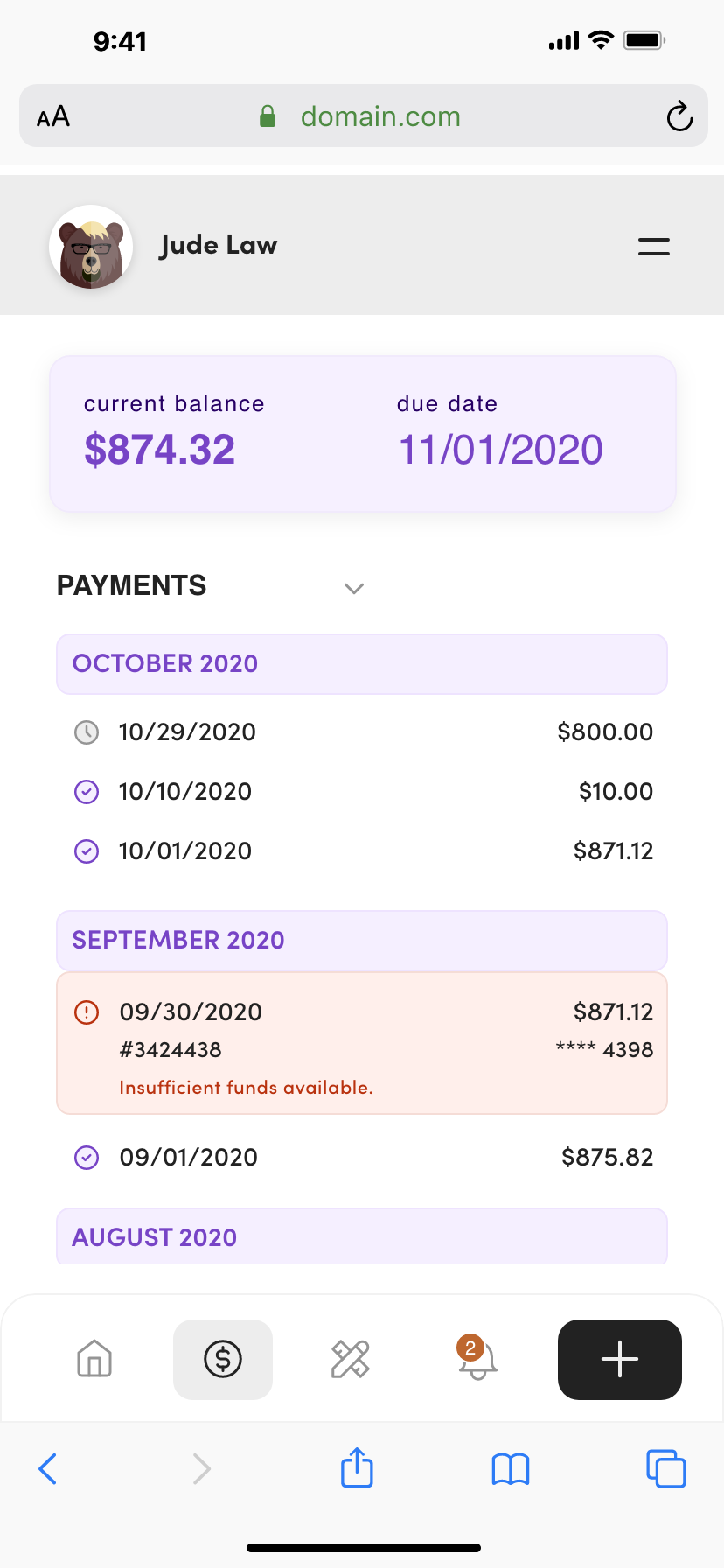
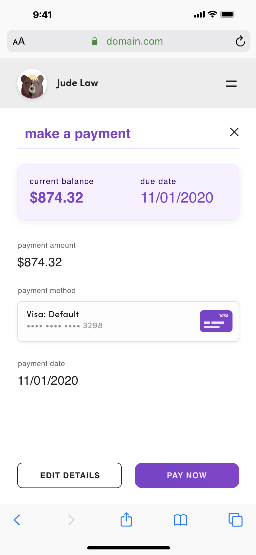
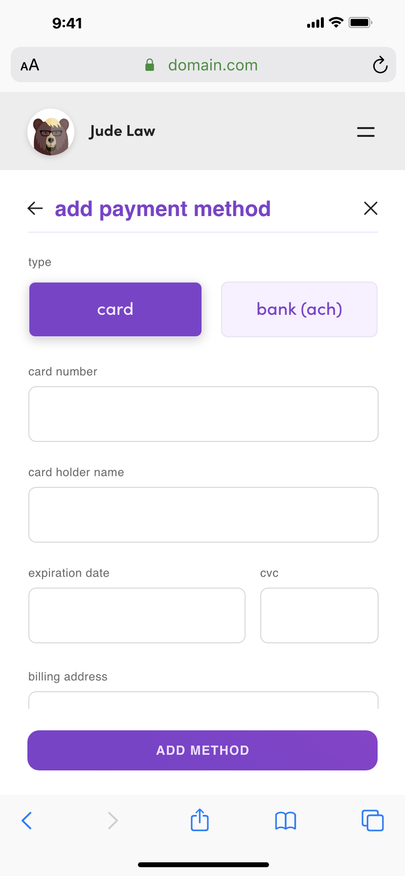
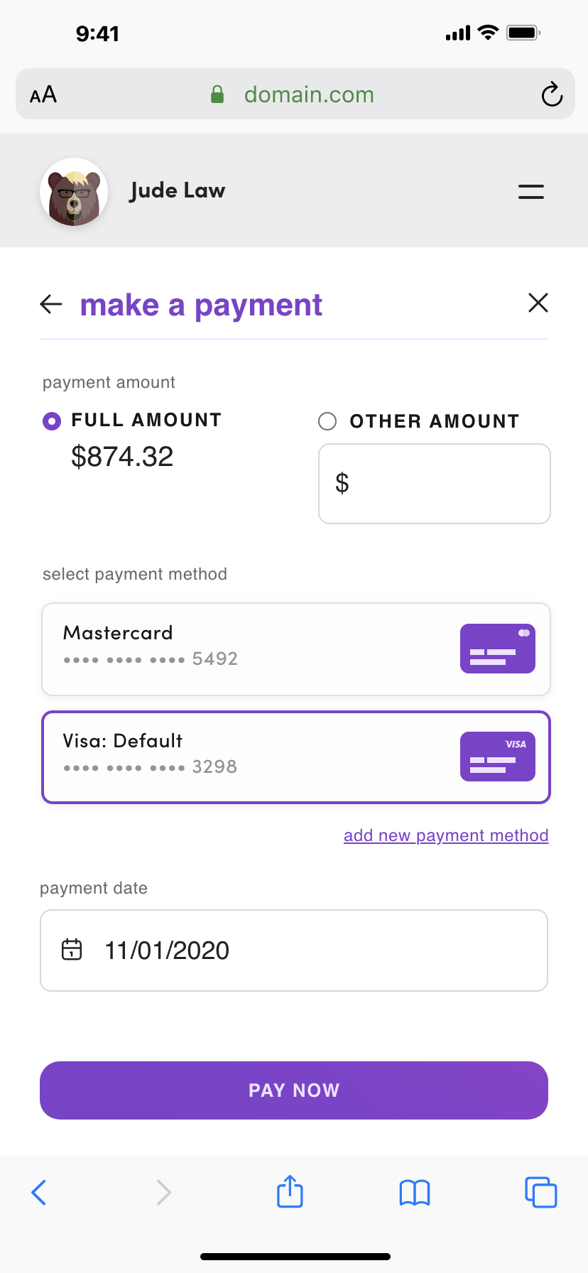
Through our user interviews, I learned that a resident was most often going to use the app to pay their monthly rent. A majority of the people that were interviewed, 83%, said they would normally only open the app 1-2 times a month, and that would be to make a payment. With this in mind, I wanted to make it as easy and quick as possible for a user to accomplish this task. I was able to condense this repetitive and important task down to 2 touch points for most people, allowing a payment to be completed in seconds.
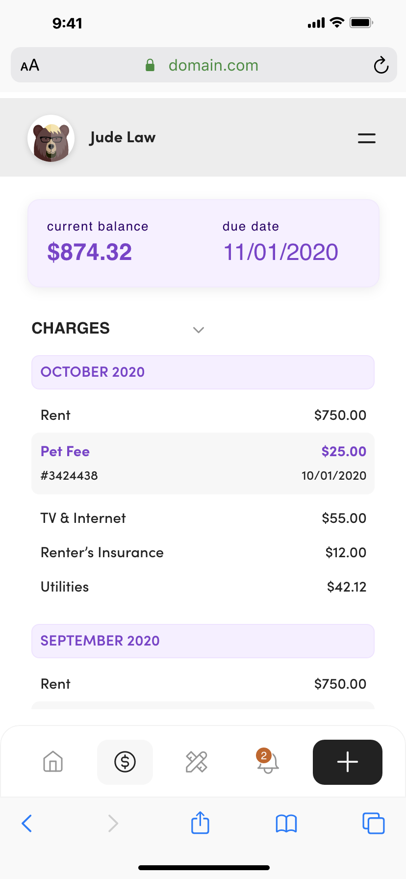
Resident Ledger and Payments
One of the main actions that a user takes in the app is searching for healthcare providers that are in-network with Fairos. Users need to be able to search for providers by name, specialty, and location. The client also has a feedback system in place for each provider, so the overall rating needed to be shown visually as well.
Service Requests
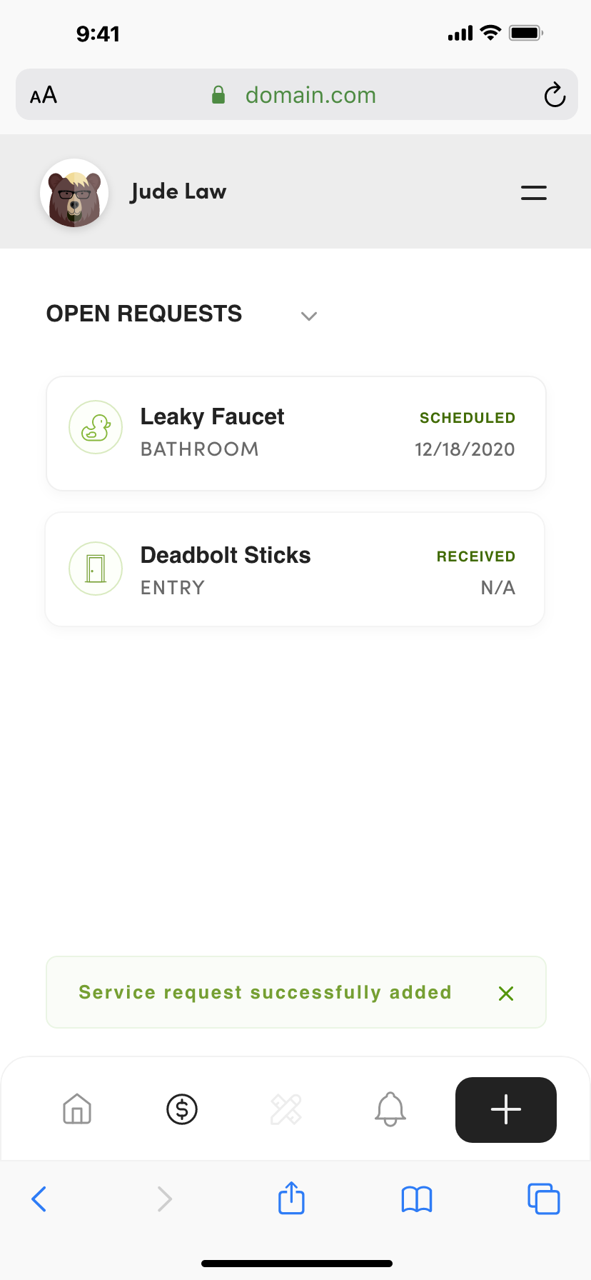
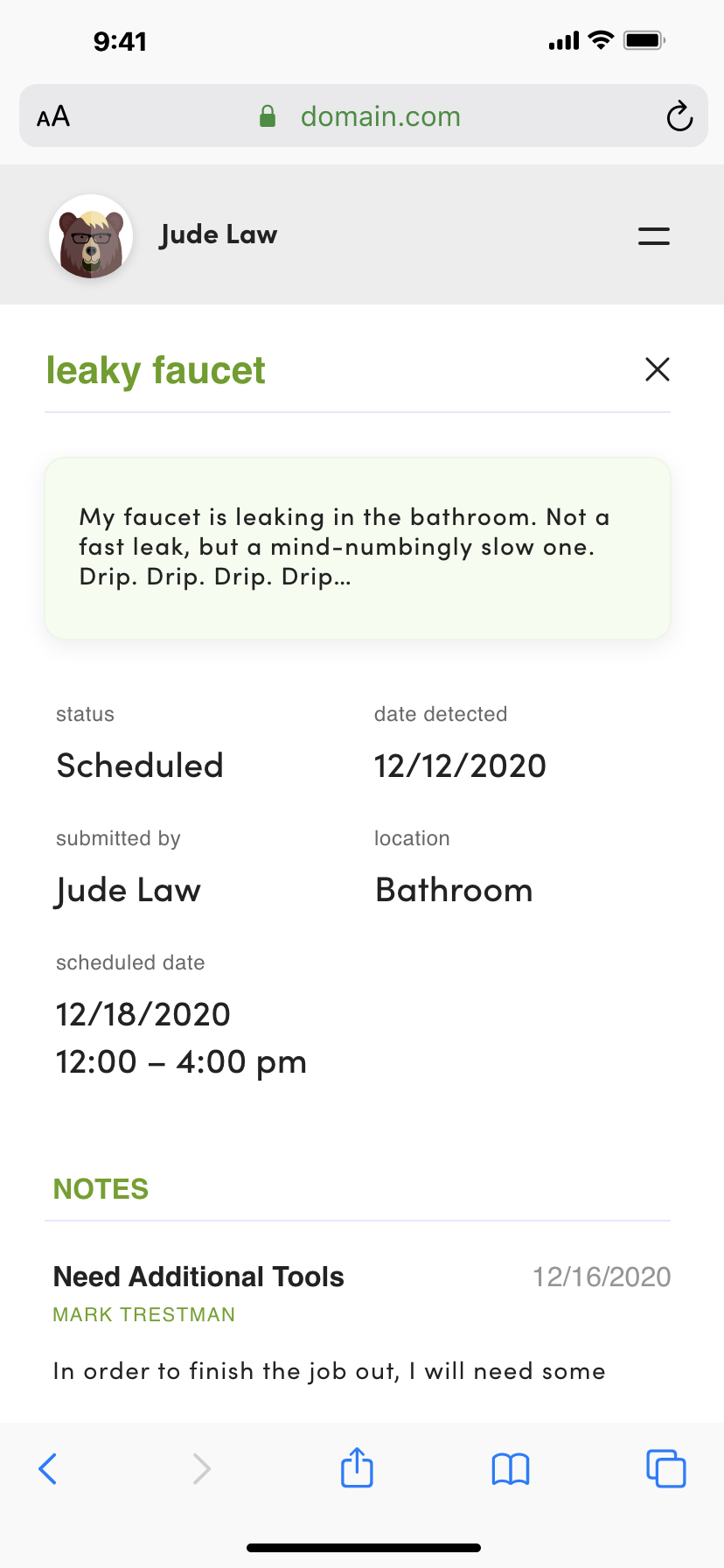
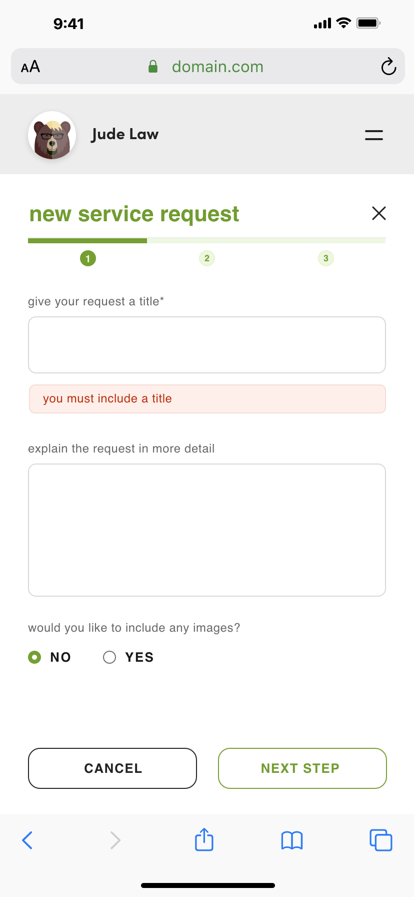
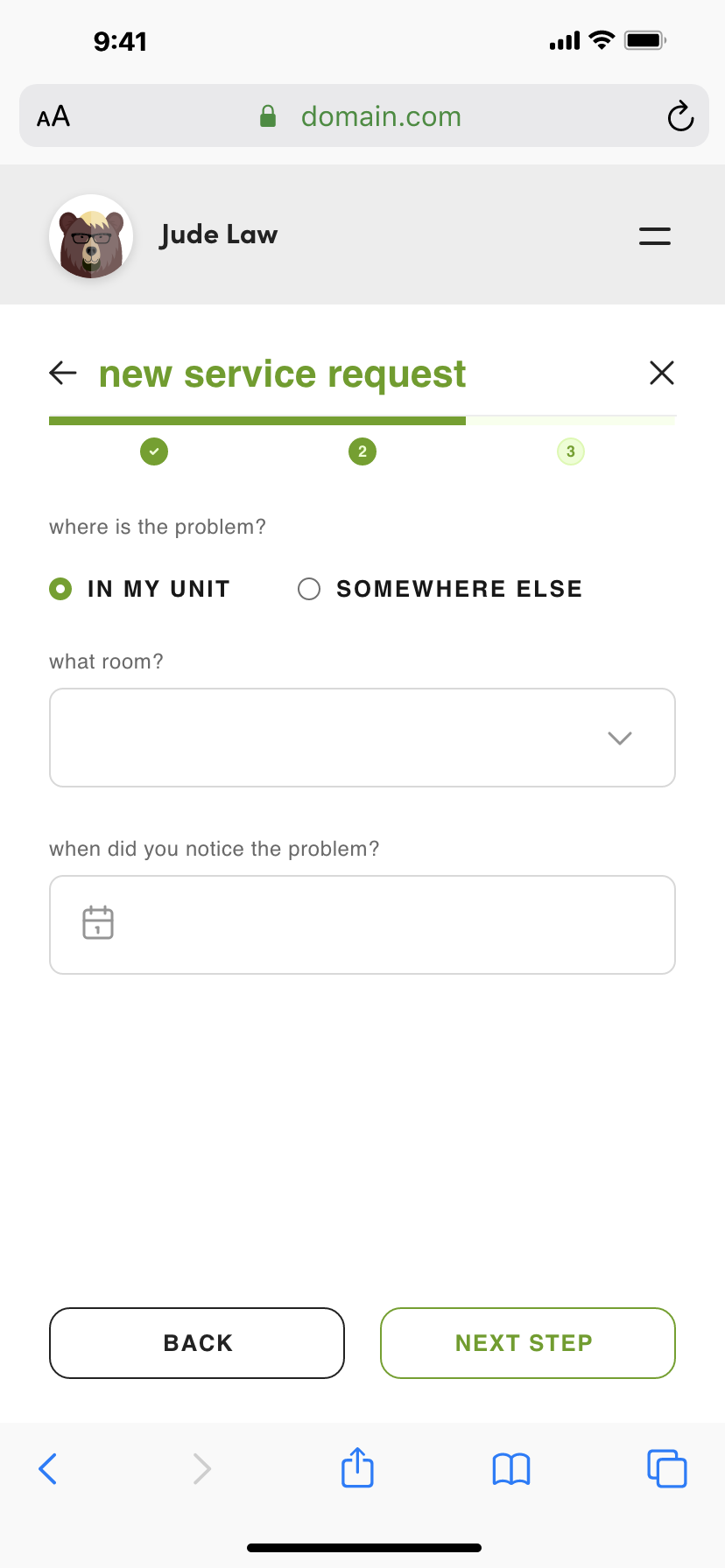
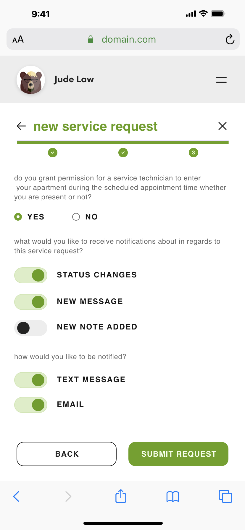
The ability to quickly and easily create and submit a service request was one of the highest ranked features for users. Although this was, hopefully, something they would not use regularly, the process needed to be easy to get to and complete. I designed this feature in a way that a user would be able to see a record of both their open and closed requests, as well as the specific information for each request, including the initial request submitted, when it is scheduled for completion, and any notes entered by the person or staff working on the request. These status updates serve as both a comfort to the user so they know their problem is being addressed, and it also saves time for the office staff who would repeatedly get calls asking for updates in the past.
Results
Within the first 6 months after launch, the client implemented the app at over 20 different apartment complexes. There was a 43% increase in online bill payments during this time, seeing a reduction in late payments and freeing up additional time for the office staff that was previously spent taking payment information. The amount of reported and completed Service Requests also more than doubled during this period compared to the year before.