Fairos Member Portal
- Fairos Rx
- Web-based App
Fairos is a proven healthcare strategy that replaces conventional PPO health plans. The client wanted a redesign of their existing product from the ground up, bringing not only a fresh look but also a much-needed improvement to the user experience.
The Problem
Fairos’ existing product had an outdated UI and a poor user experience that was causing pain points for its users. It also had a poor mobile experience, forcing users to use a desktop in order to more easily complete basic tasks.
The Goal
Interview existing and potential users and employees to learn which tasks would be performed most often, taking care to ensure these tasks were intuitive and as easy as possible to complete. The UI needed updating to have a more modern feel to improve the overall user experience. The existing user journeys also needed to be reworked to cut down on extra steps and limit a user's cognitive load. These changes should result in a higher number of in-app bill submissions and allow users to find healthcare providers in the app rather than contacting the company for assistance.
My Role
I was responsible for the initial UX Audit, interviewing existing users to identify pain points, and creating the updated proposed user journeys. I also put together wireframes to visually show the user journeys and to get a basic idea of what information would need to be contained on each screen. From here I moved on to high-fidelity designs and prototypes for each of the customer journeys. I tested these with Fairos employees only because of the client’s time constraints and preferences and then iterated as needed based on their feedback. To complete the project, I created a working and responsive in-browser prototype by developing the designs using Vue, HTML, CSS, and Javascript.
Existing Design

New Design
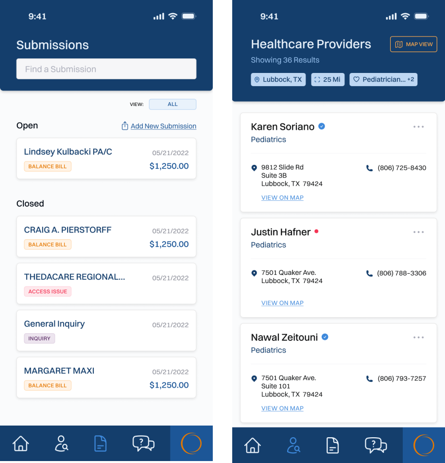
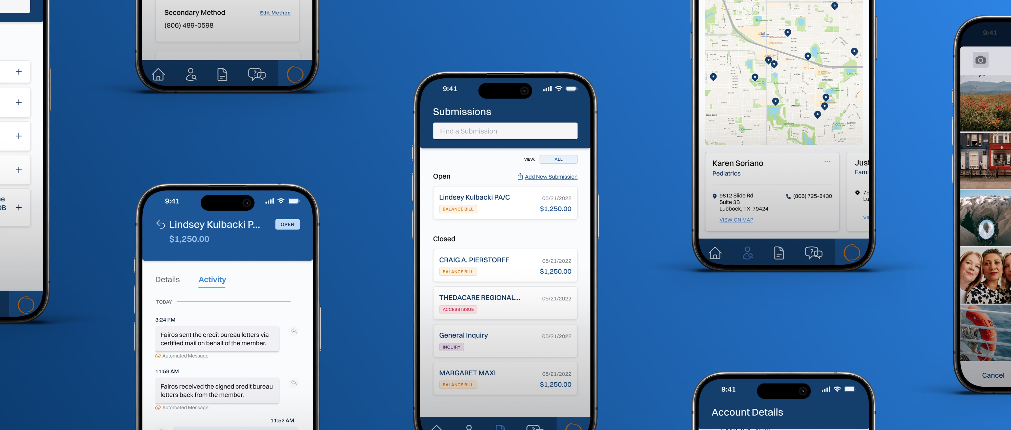
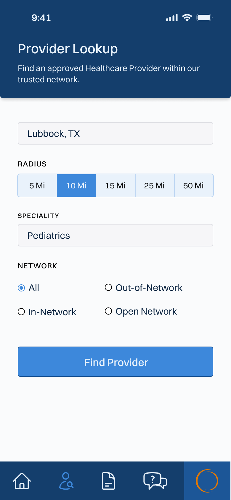
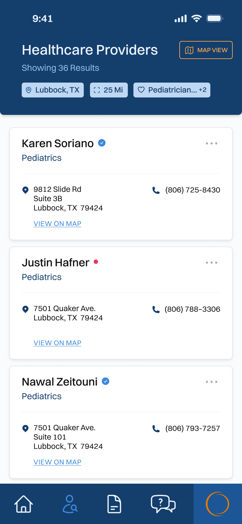
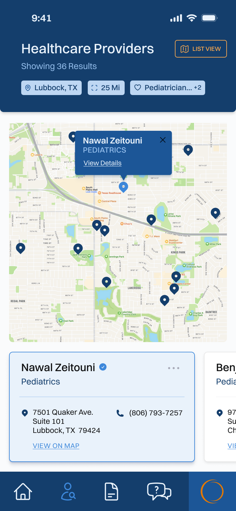
Healthcare Provider Search
One of the main actions that a user takes in the app is searching for healthcare providers that are in-network with Fairos. Users need to be able to search for providers by name, speciality and location. The client also has a feedback system in place for each provider, and so that overall rating needed to be shown in a visual way as well.

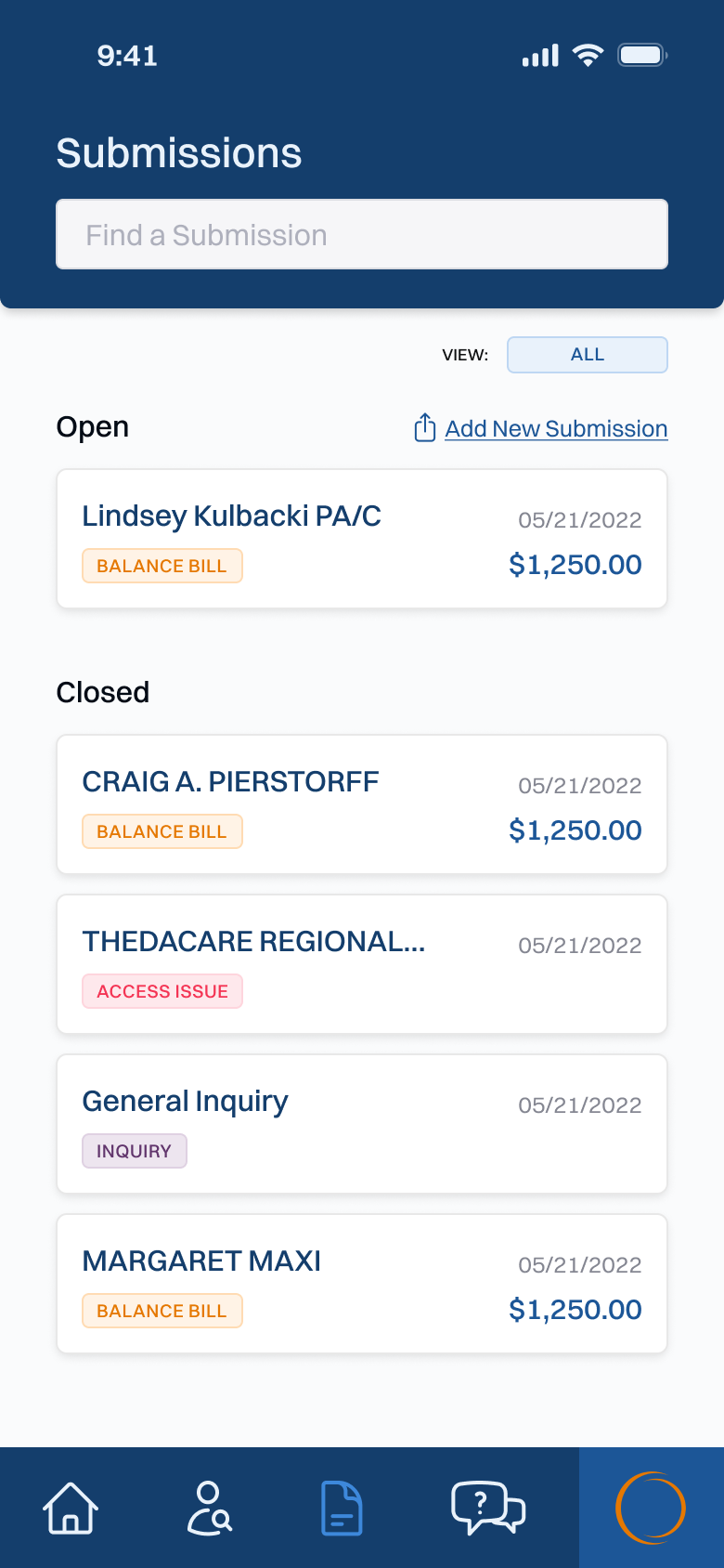
Submissions
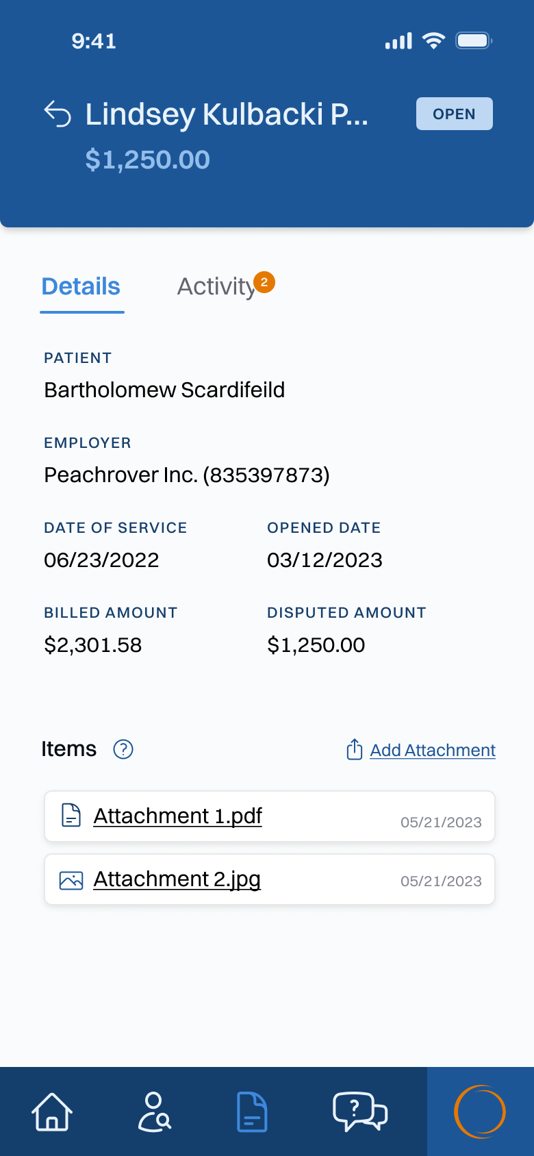
A user can submit three different types of information: Balance Bills, Provider Feedback and General Inquiries. The Balance Bills and Inquiries have the ability to upload and manage attachments, as well as full chat capability with a Fairos employee.

Results
I was able to reduce the overall process of adding a new balance bill from 4 screens and a total of 16 clicks/touches down to 1 screen and 3 clicks/touches. This greatly reduces the overall time it takes to submit a new and has a positive impact on a user's cognitive load when using the app. The new UI and experience were well received when it was beta tested by users, receiving very high ratings in ease of use and overall visual appeal. We turned the app over to the client once it was ready for launch, where it was to be handled by their internal team.